An imposing structure illuminated by the evening sun & a strong reflection of the evening sun from Gehry’s nearby Disney Concert Hall. Don’t think I have much to say, other than that it’s a cool building. And that I used a lot of generative fill to remove a flag pole from the picture above.
I went downtown to take pictures of the LADWP building next door, but this New Formalist office building kept catching my eye. It’s almost a little Gothic feeling where the brackets leap to the roof. Presumably windowless at the top for lots of 70s-era mainframes? Froelich was known more for his horizontal work (as an internationally renowned horse race track designer), so this vertical design was an outlier for his firm.
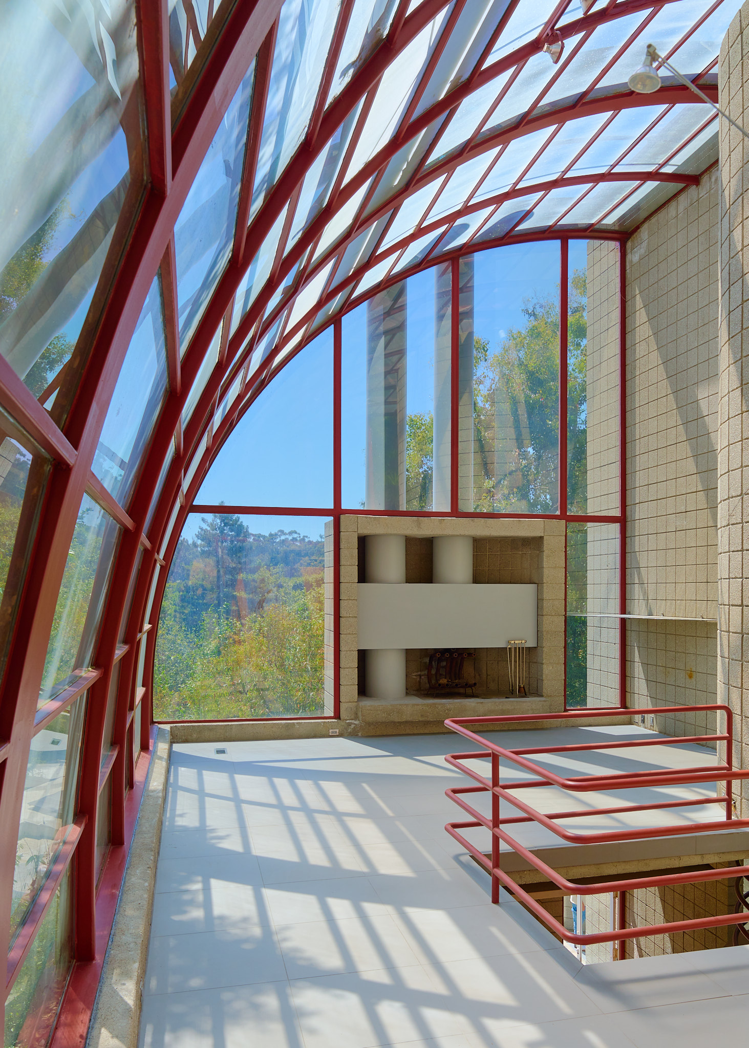
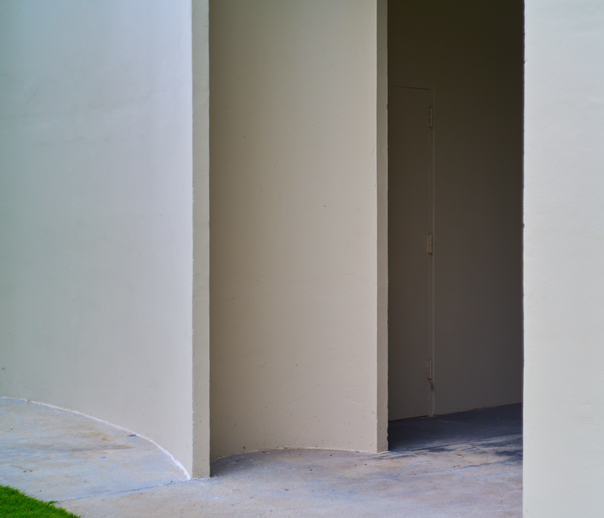
Made to the drive to see my first Ray Kappe design, though this is not — from what I can gather — a typical Kappe. No wood here except as accents; this one’s all concrete and steel and glass in a masterful interplay. Was the client a big fan of Frank Lloyd Wright’s Los Angeles concrete block fortresses? Those are my favorite Wrights, though here Wright’s patternwork has been replaced with off-the-shelf block. Which — combined with the lack of furniture in the house — induces a slight sense of abandoned prison. Combine that with the turret (pictured below), and you start to get a sense of why this house didn’t sell a few years ago when it went on the market.
Took a trip to Cleveland, so naturally I consulted my usmodernist.org map and found this abandoned 1953 Richard Neutra design in Walton Hills, not far from my brother’s woodworking studio in Bedford. Incredible to see a Neutra in such a state, though even more incredible to see a Neutra on a huge green yard up against a huge green forest. Also the first Neutra I’ve ever seen inhabited by a family of raccoons (was surprised (and a little spooked) to find a tail visible in that last image).
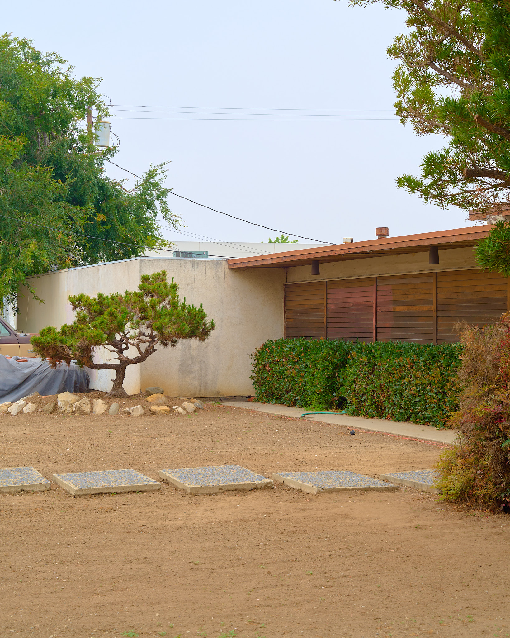
A little while ago I wrote some code to pull house addresses from the USModernist architect archive and put them on a map, since I wanted to see where all the modern houses near me in Greater Los Angeles were. It’s fun to go somewhere and take a look at the map to see if there’s anything of note around, which is how I ended up here at the Kabata House in Gardena, a seemingly unaltered 1959 design by A. Quincy Jones — a low-slung modern surrounded almost entirely but heavy industry, which makes for an odd site: a giant crane looming over the houses’s concrete block perimeter wall. Was this a more residential area at some point? Or just an eccentric location for a post-and-beam?
Inspired by an interview with Frances Anderton on the Building LA podcast, I decided to seek out and photograph some design-forward affordable housing developments in LA County. First up was one not too far from where I live: Pasadena Studios, just south of the 210 in Pasadena, designed by Stanley Saitowitz — an architect I first came across in the 1993 Michael Blackwood documentary The New Modernists: 9 American Architects. It’s a fabulous film, as are most of the film-era Blackwood documentaries (not sure why, but as soon as his stuff went digital it really altered the vibe), and Saitowitz is one of the more intriguing characters in it; I particularly enjoyed his languid South African accent discussing the failures of deconstructivist architecture (“a rotten chicken with nails sticking through it”), and the scenes of his incredible Natoma St. office under construction.
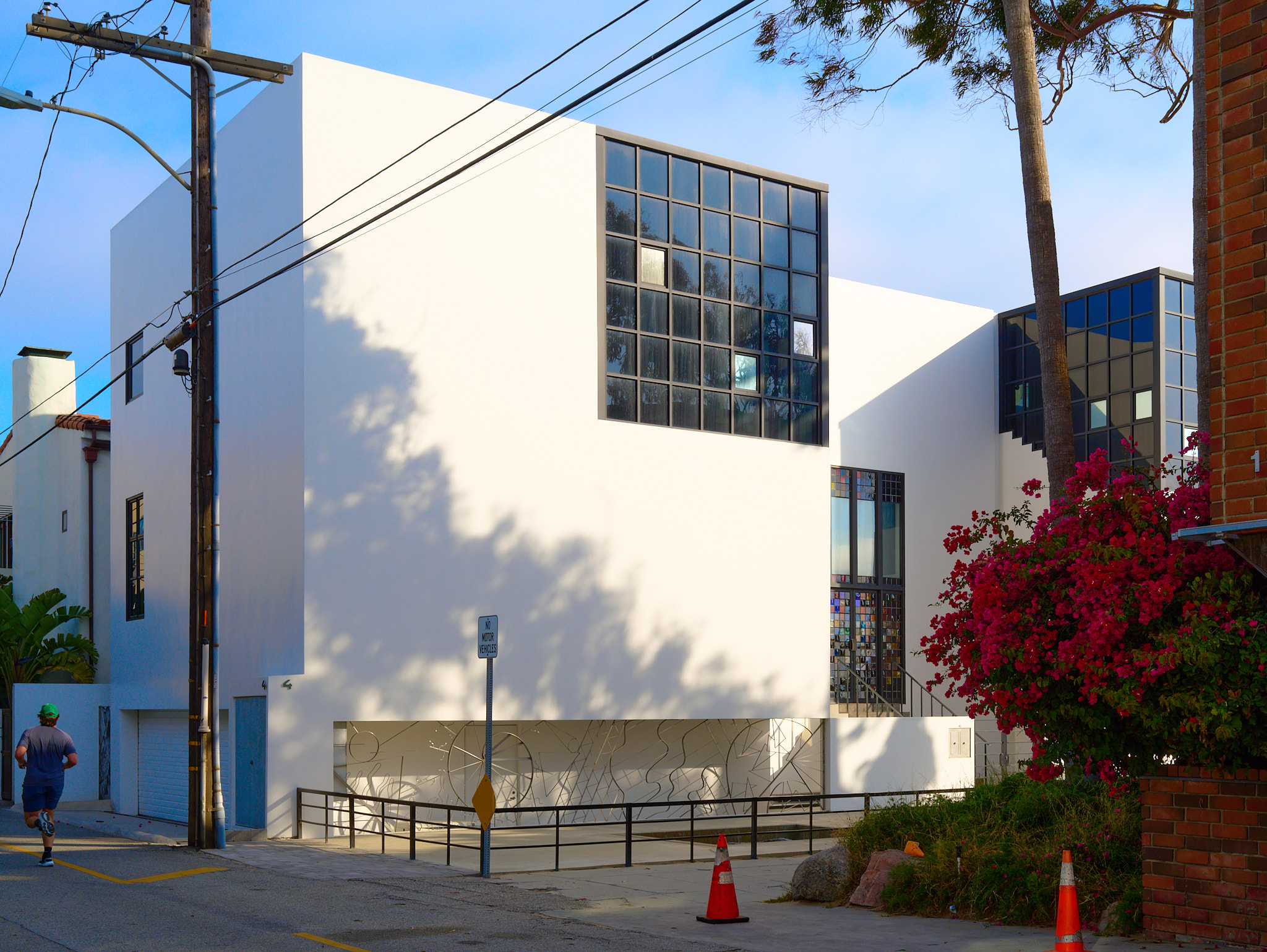
Two adjoining Venice properties, both designed (or was one just renovated?) by David Ming-Li Lowe, an architect that’s been featured on this account before for the Earthquake House in Sawtelle — a house that’s a clear successor in style and material to the taller of the buildings featured here (308 Venice Way). I’m not quite sure how to date either, as Lowe was on record as saying both were worked on over many years, and both were self-funded / self-owned projects.
It’s a a slice-of-life depiction of architecture and architects working in and around Venice in the late 70s and early 80s — Gehry, Morphosis, Frederick Fisher, etc. — and comes with a map of all the houses mentioned. So of course I recently went to Venice to photograph all the buildings I could find, which was a blast.
I’ll be posting each house I visited as a separate entry here, but my first stop (as I worked my way northward along the shore) was this house: the Doumani Beach House, designed by the Mexican-American sculptor (and non-architect) Robert Graham.
You hear a lot about Neutra’s houses; much less about his civic work. I first came across his Hall of Records in this great article all about its clever — and ill-fated — system of sun-breaking louvers on the southern elevations. Clever because they once turned throughout the day to block the sun as it moved; ill-fated because, well, they’re broken. Which turned Neutra’s elegant alternative to the glass-box skyscraper into a complete failure that wastes energy on excessive air conditioning.
While walking around on Poppy Peak Drive in Pasadena (hoping to see a Harwell Harris, a Neutra, and a Buff & Hensman on the same twisting street), I happened upon this low-slung home and was immediately intrigued by the shallow-pitched double gable roofline and the strong rhythms on this slim southwestern elevation.
I had never heard of the architect Kenneth Nishimoto before seeing this house, but it was easily my favorite on the walk. Turns out he was a 1934 USC grad, though only 8 years later he was interned at a concentration camp in the Arizona desert, where Nishimoto’s daughter — the current owner of the house — was born.
Took the family to see the nearby Kubly House, a Craig Ellwood design that just hit the market. We got there right before the afternoon open house closed. Not a steel frame this time, which isn’t “classic” Ellwood; apparently he hoped, in 1965 when this house was built, that it would be his last wood frame house ever.
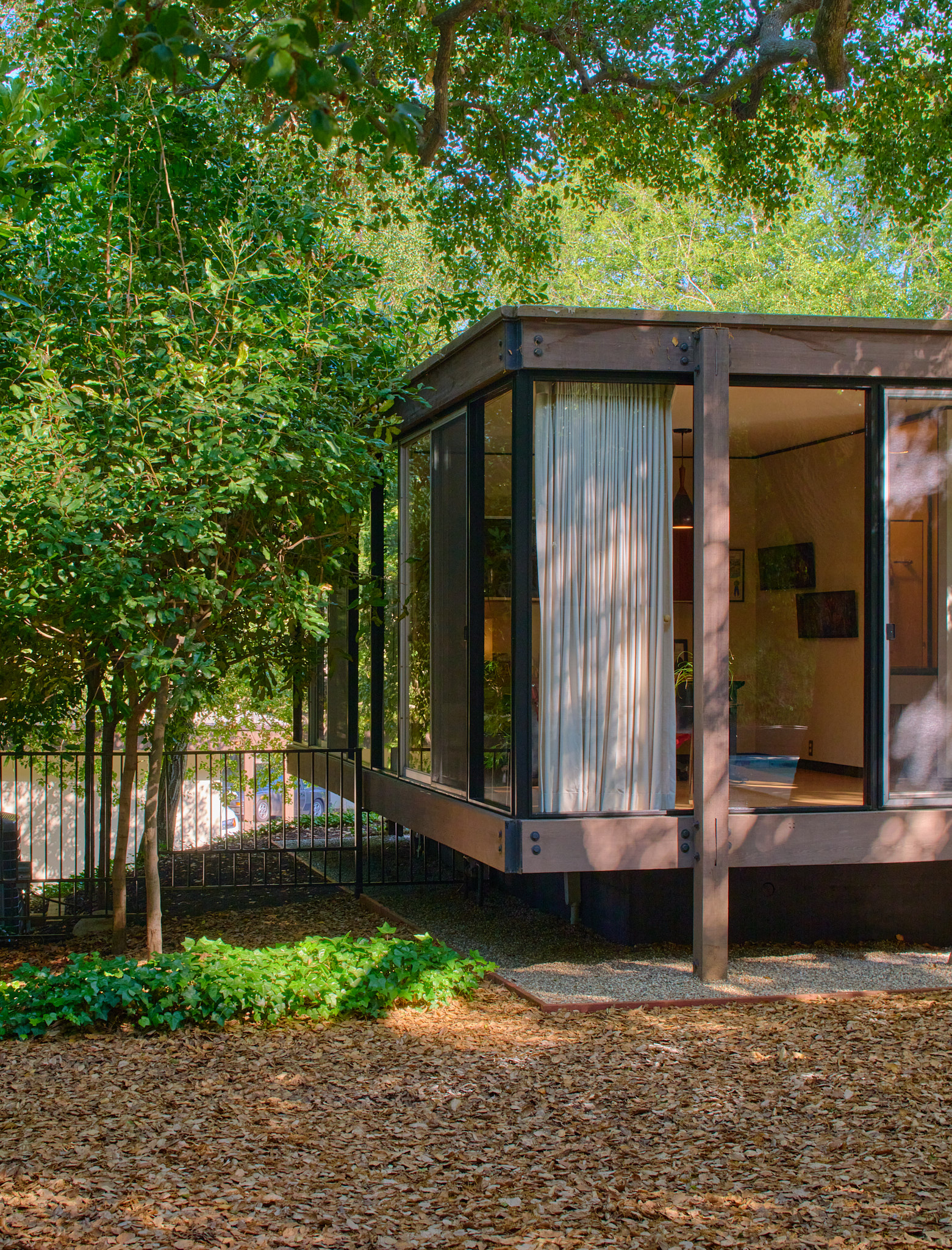
Incredibly minimal, as always, though this house — a raised, rectangular wood-frame glass-wall pavilion surrounded by a channel of gravel on all sides — feels Japanese-traditional in a way the Smith House did not. Even the narrow passages running along the long edges of the rectangular plan reinforce that feeling. Lovely to walk from bedroom to kitchen through the long shadows of the heavy wooden posts.
Kaki — last photo — seemed to enjoy her time here (she loves to pick up little rocks).
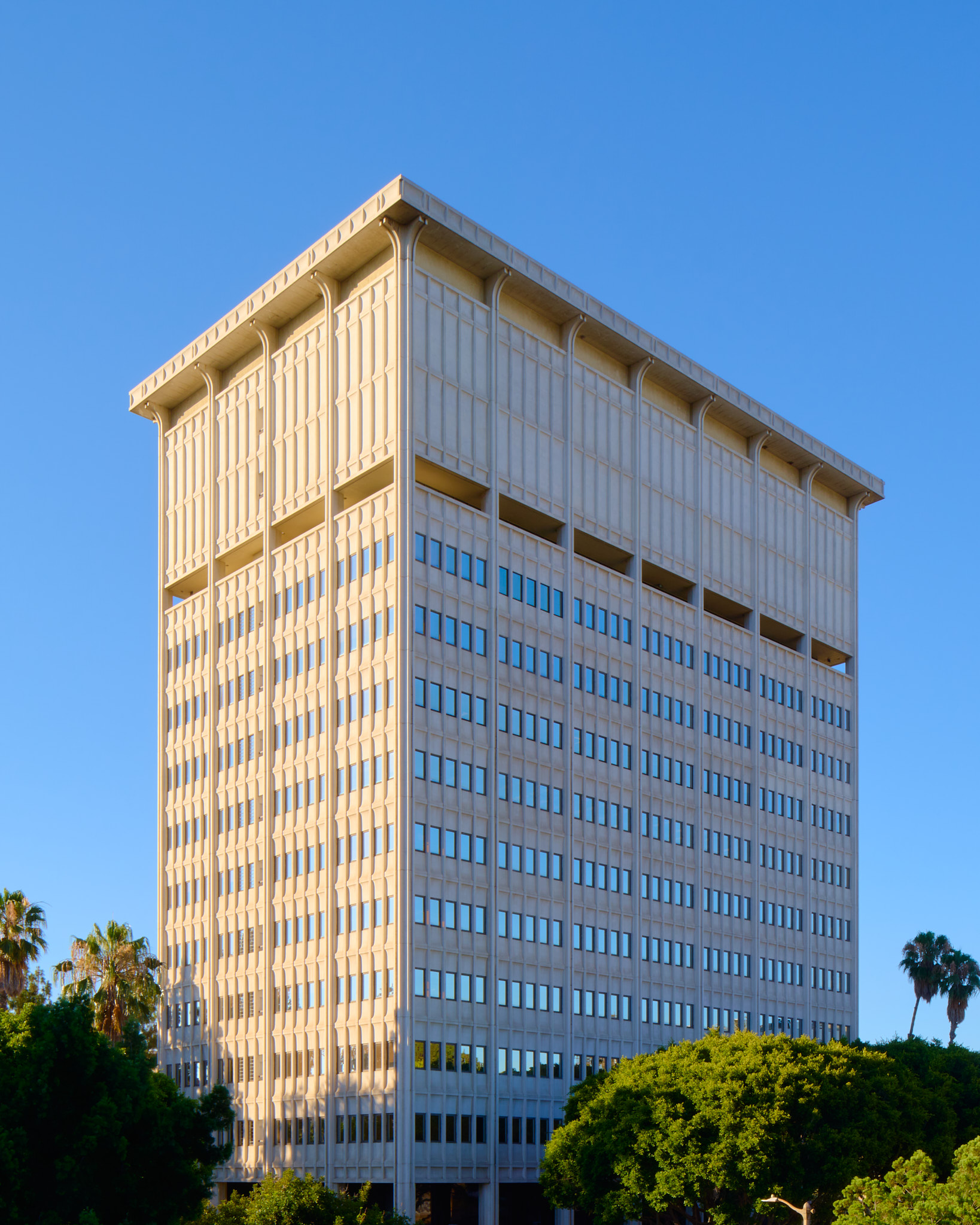
High-Rise Look Comes to Arcadia. That was a headline in Dec. 27, 1964’s Los Angeles Times. “The profile of Arcadia, which has changed from a community of chicken ranchers to a city of homes and apartments in two decades, is on the threshold of high-rise building.”
Apparently the first building in Arcadia to reach eight stories was this one, the “Six Twelve Medical Center” from 1965, designed by the partnership of Fleming & Coppedge (two Oklahoma-bred architects operating out of Arcadia in the 1950s and 60s).
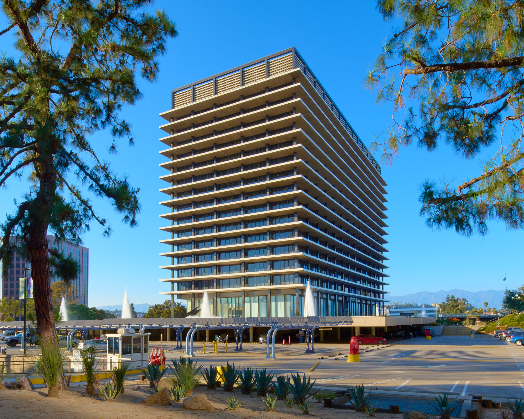
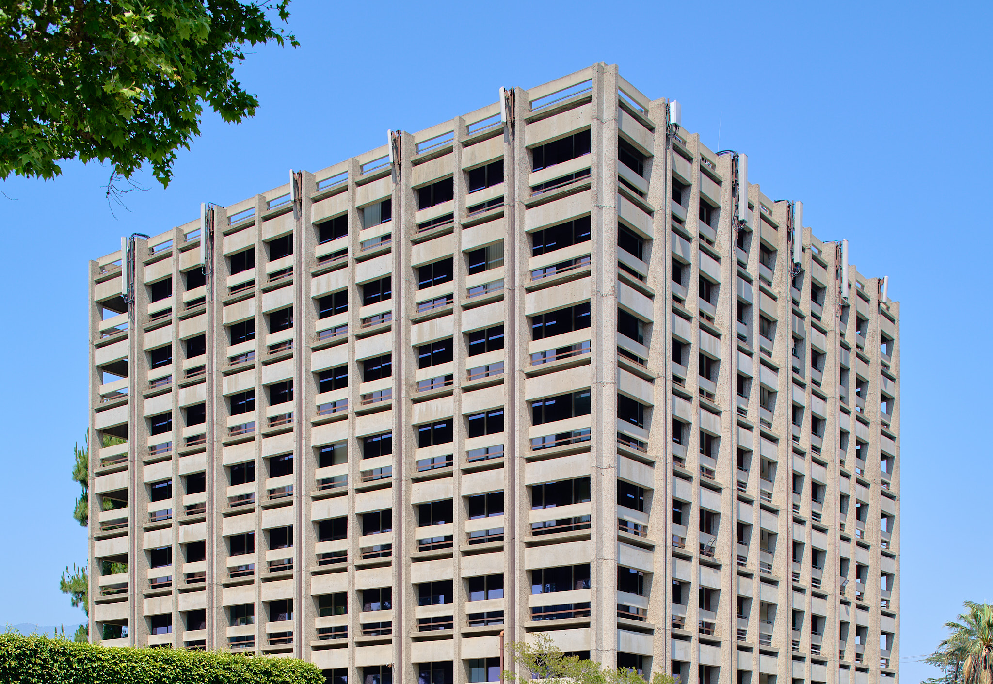
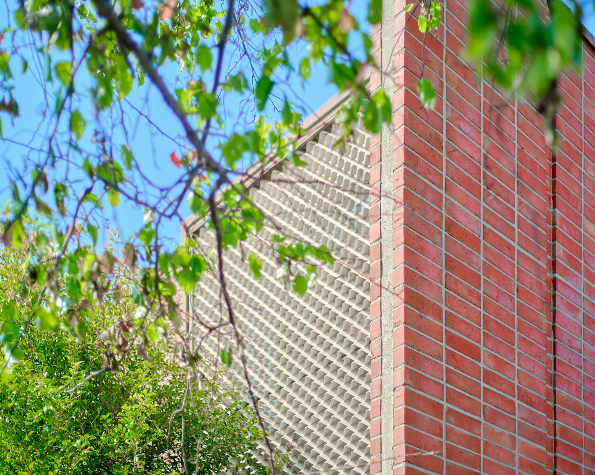
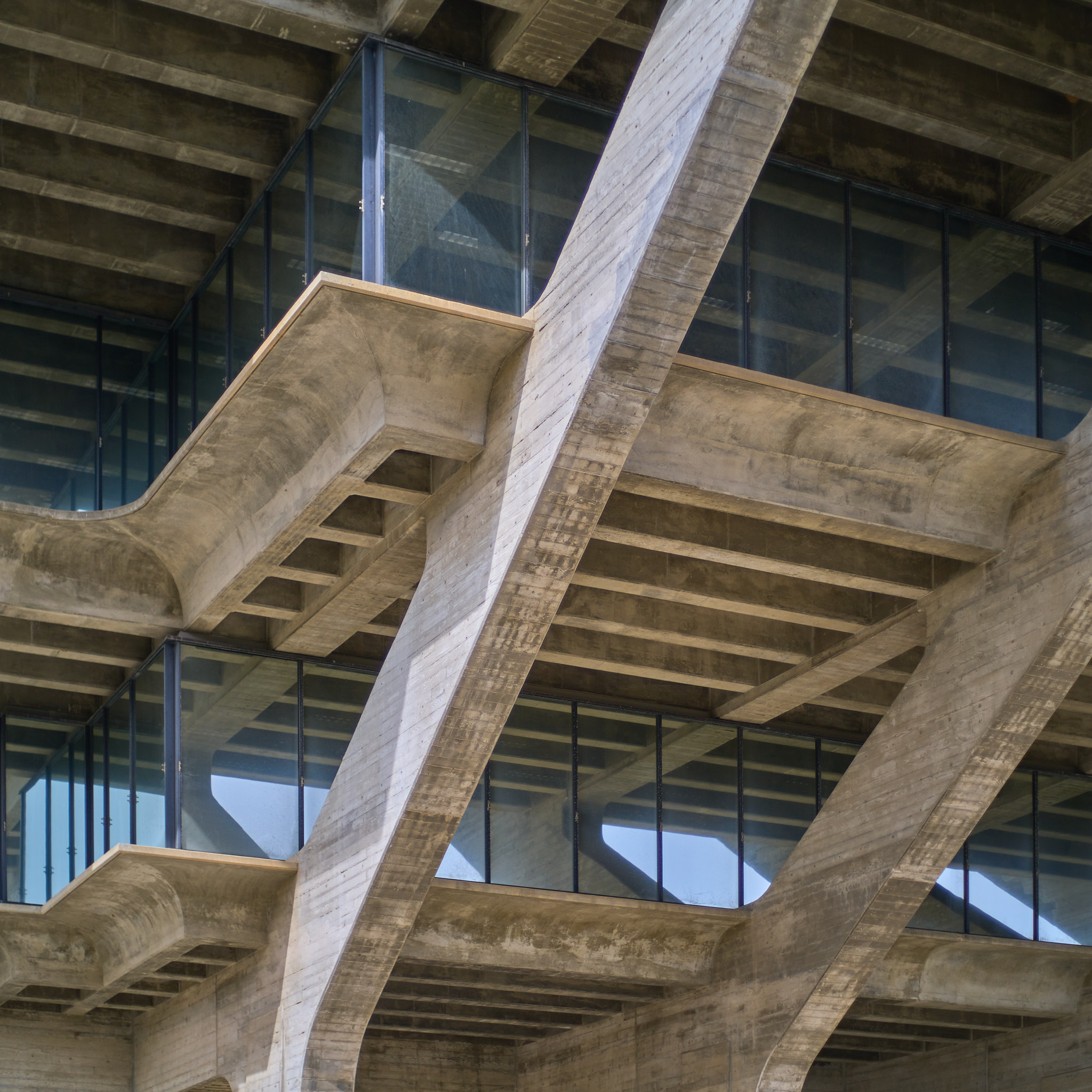
It’s the kind of building — hidden, as it is, behind a number of tall Canary Island pines — that’s easy to ignore from the street. But when you park your car in the expansive lot and approach it from the south, there are no trees to obfuscate what is surely one of the strangest buildings for miles around: a steel-and-glass tower surrounded on all sides by a latticework of shallow concrete patios, piers, and panels meant to block out the harsh summer sun — a design strategy that recalls most clearly Le Corbusier’s Unité d’Habitation in Marseilles, though I keep wondering: is it really possible that this unassuming medical office building in Arcadia was inspired by Le Corbusier’s proto-brutalist masterpiece?
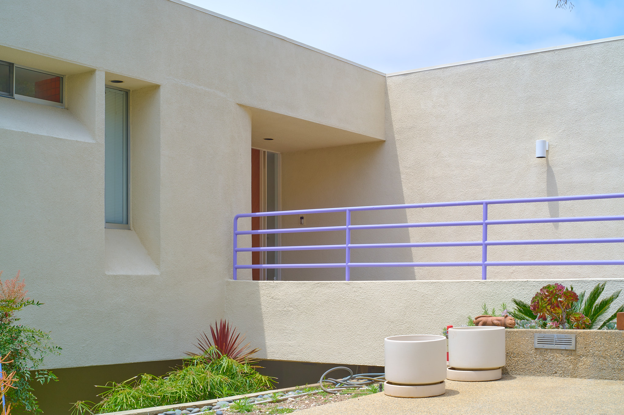
While I was up in Crestwood Hills to visit the Smith House, I drove around a little on some of the winding nearby streets, with the aim of ending up at a Ray Kappe design at 12256 Canna Rd. That house turned out to be very difficult to see from the street, but a purple railing in front of the next-door neighbor’s house immediately caught my eye. I took a few photos of what I could see of that house, marveling at both its simplicity and its playfulness: a barely-visible cylinder at the front door, subtle wire sculptures lining the road.
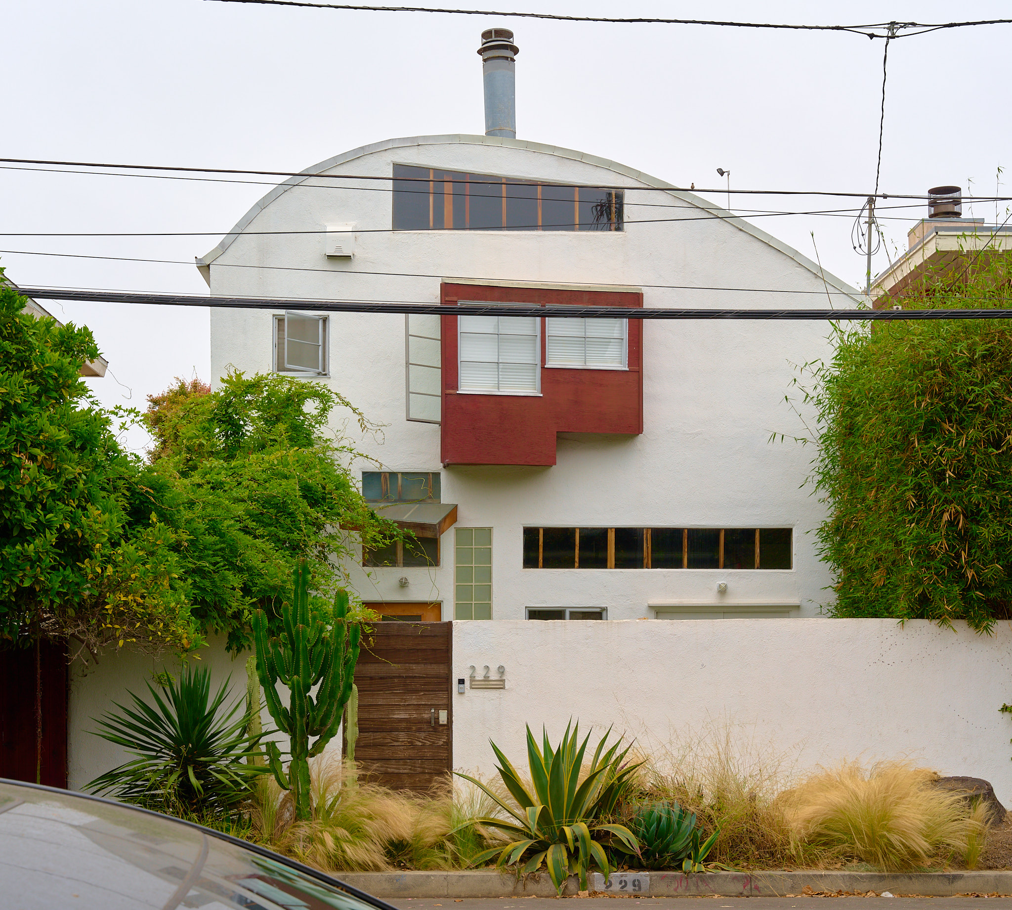
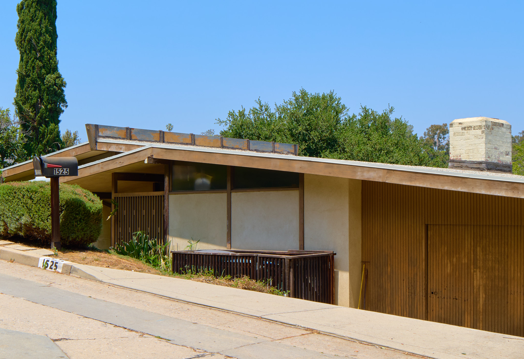
I was thinking it had to be something from the 1970s, with its small-window-post-energy-crisis-fortress-like street-facing facade, and when I got home I was happy to find out it was a 1978 design: the Gelber Residence by Martin B. Gelber, a Los Angeles-born, USC-trained architect who passed away in 2019 at the age of 82. He lived in this self-designed home for 40 years with his wife, Michela Gunn, who appears to still own it.
I get the sense that late 70s modernism is fairly un-loved, but when I arrived the May grey had just lifted and the sun was casting soft midday shadows across the plain stucco exterior. Stumbling on this house was a real treat.
Made the trip to Craig Ellwood’s Smith House in Crestwood Hills. Was very excited to finally step inside an Ellwood design & this one did not disappoint. Feels a little like an apartment plucked from a downtown high-rise and dropped onto the hills of Brentwood — minimal almost to the point of monastic, though I love the way the landscape has grown onto the house, little branches curling around the blue steel frame. Back in 1958 the hills were treeless, but today it’s a treehouse. And an expensive one! Deft timing to put an Ellwood on the market right after Chris Pratt destroyed Ellwood’s Zimmerman House not too far from here.
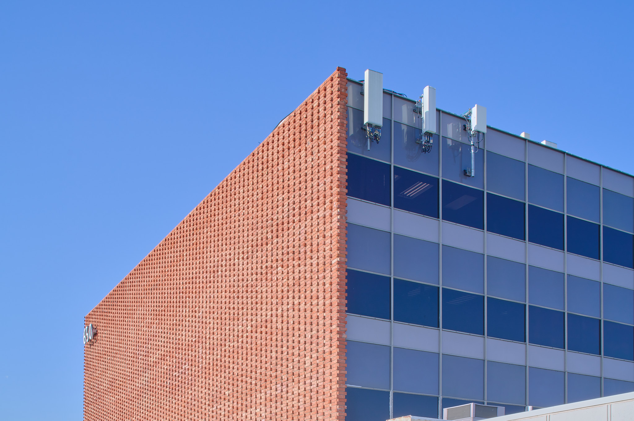
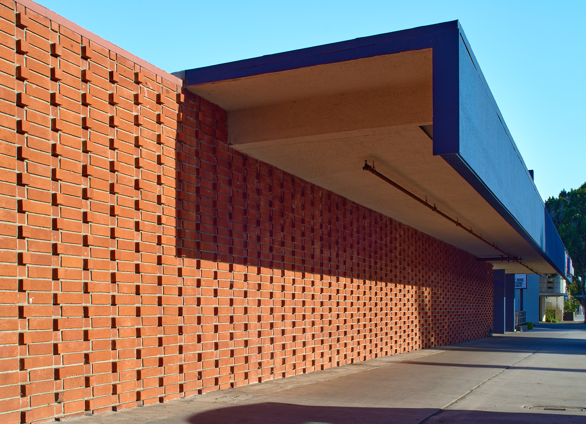
On the south side of Duarte Ave. in Arcadia, just east of Baldwin Ave., there’s a stretch of four corporate midcentury mid-rise moderns, each with a different take on how to block the summer sun. I’m hoping to photograph all four, but this time it’s the most straightforward of them all: a four-story, totally square office building built in 1958.
How does it break the sun? While the northern and southern elevations are fully glazed, the eastern and western elevations are completely opaque — “self-shading” articulated brick bond walls suspended from the concrete-and-steel frame. “Self-shading” here means the header bricks project from the stretchers and (the thinking went) allow the sun’s heat to dissapate more quickly than it would from a completely flush brick wall. Unclear if this is true at all, but it’s a fascinating, pseudo-decorative look, especially when you see the zig-zag of bricks up close where they end just above the first floor of office suites.
A few months ago, when my dad came over for dinner, we got to talking about a building that’s always loomed large in my imagination: a house in Connecticut compromised of two connected octagons.
The house still exists, sort-of. These days it’s much larger and the original octagons are barely visible. But when the house was finished in 1968 and my grandparents moved in, it was as you see in the image above, an uncompromisingly weird late modern home — two octagons connected by a little kitchen.
But when my dad and I were talking about the house over dinner, I had never seen it in that original state. I had imagined it many times. I’d even seen the modified one in person; years ago I went and knocked on the door and told the residents it used to be my grandparents house. They raised their eyebrows.
So it was a great suprise to me when, over dinner, a tiny piece of information popped into my father’s head:
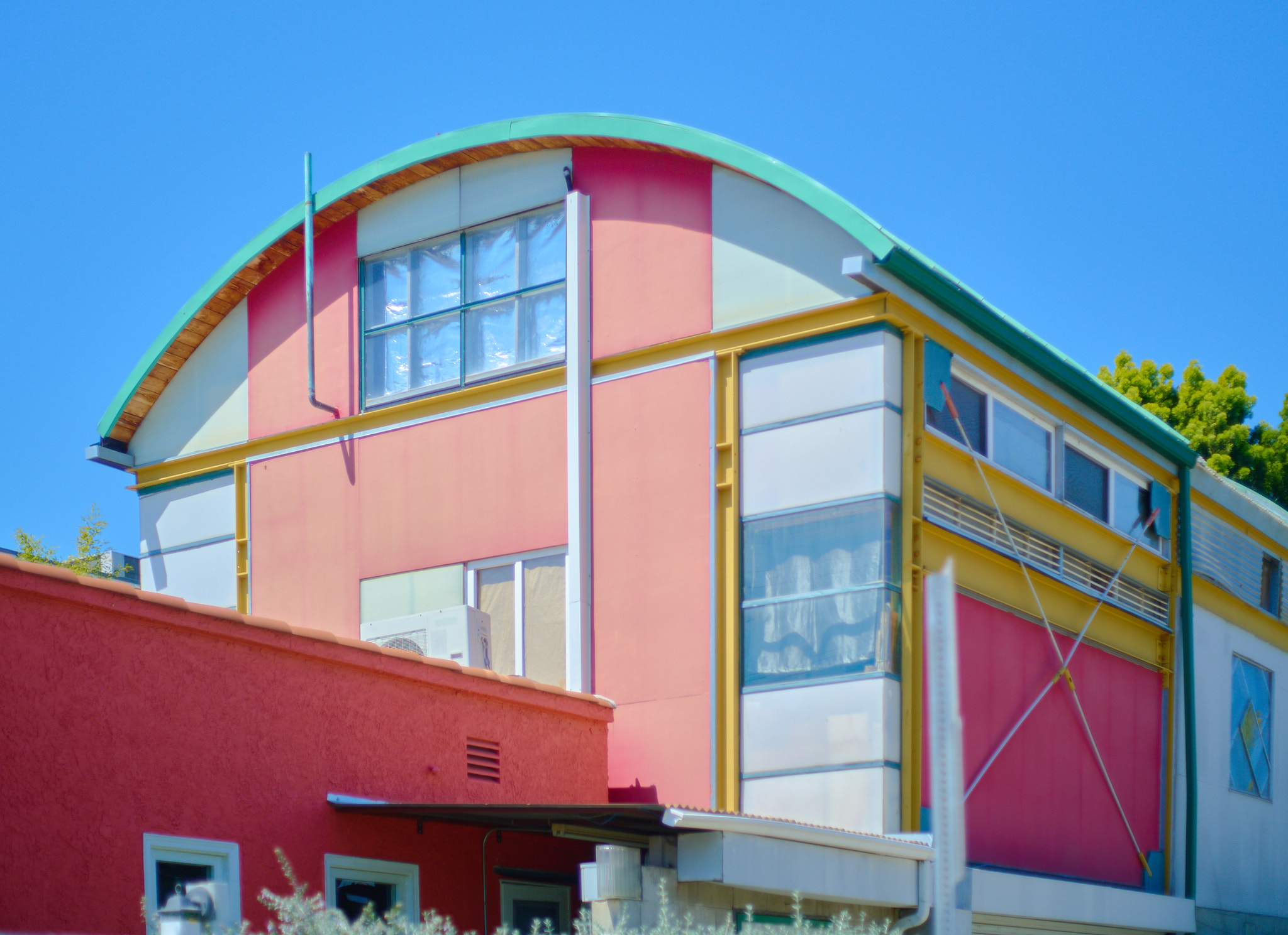
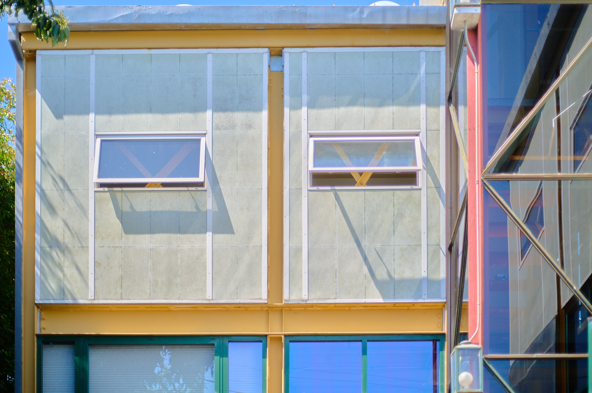
Before filming at the Earthquake House last month, I took a quick walk down the street to see another of David Ming-Li Lowe’s self-initiated designs: a small apartment building from 2003 located at 11603 La Grange Ave. There I found a wonderfully strange and vibrant structure — an evolution of the vocabulary Lowe employed at the 1990 Earthquake House.
Here he’s once again exposed the yellow steel framing and contrasted it with red and green, except now the red is more of a theme than an accent, and the green highlights the connection of the roof to the downspouts. The x-braces, too, have returned, though this time they’ve been thinned out and moved to the exterior, an even more overt reference to the Eames House.
Caught some nice late afternoon at Irving Gill’s Bella Vista Terrace (1910) in Sierra Madre. A row of jacaranda trees on the treelawn were casting lovely shadows onto the western elevation. I used “treelawn” there because this building was commissioned by a fellow Clevelander who moved out west — someone who surely would’ve known I’m talking about the bit of land between the street and the sidewalk.
It was many months ago — when browsing Architecture for Sale — that I first came across the name David Ming-Li Lowe. At the time, 1949 Federal Ave was for sale, and the design drew me in: not a style I could readily describe then or now, though its exposed studs and open rafters made me think immediately of Frank Gehry’s early work, also on the westside of Los Angeles.
I never got to see 1949 Federal before it sold, but a few months later I saw another Lowe-designed house pop up on Architecture for Sale. This time it was 1955 1/2 Purdue Ave — just a few blocks away from 1949 Federal — and this design was even more intriguing: cadmium yellow steel framing throughout, galvanized steel refrigerator sheets for insulation, Kalwall panelling to let in soft light to the upper floors. Not to mention the 17 base-isolating dampers that give the house its evocative name: The Earthquake House.
If you’re ever in South Pasadena, make sure to stop in at 1414 Fair Oaks Ave., preferably on a sunny day to get the full effect of the incredible sun breaking metal roof that sits above the loose grouping of mid-century offices.
Once upon 1414 Fair Oaks was the combined offices of the architects Smith & Williams, the planners Eisner & Stewart, and the landscape architects Eckbo & Associates. Together they were a loose collaboration — separate business literally working together under one roof — known as “Community Facilities Planners” (a name so generic it’s almost impossible to remember).
But this building (buildings?) is anything but generic.
I finally got to stop by 1020 S Baldwin Ave with a camera. I’d been meaning to photograph this building for quite a while, as I’m always struck by the dramatic cantilever and brickwork whenever I drive past on Baldwin in Arcadia. Turned out to be a handsome building; I was pleasantly surprised by how nice the overhanging forms on the south side were.
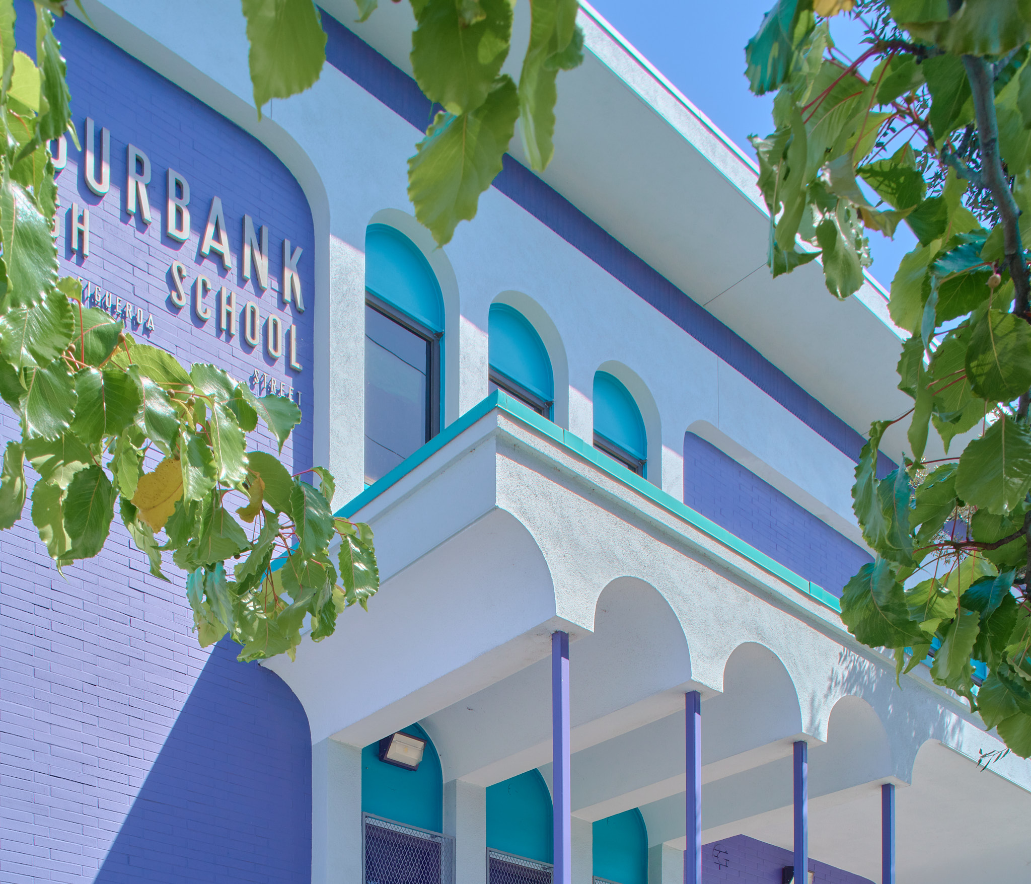
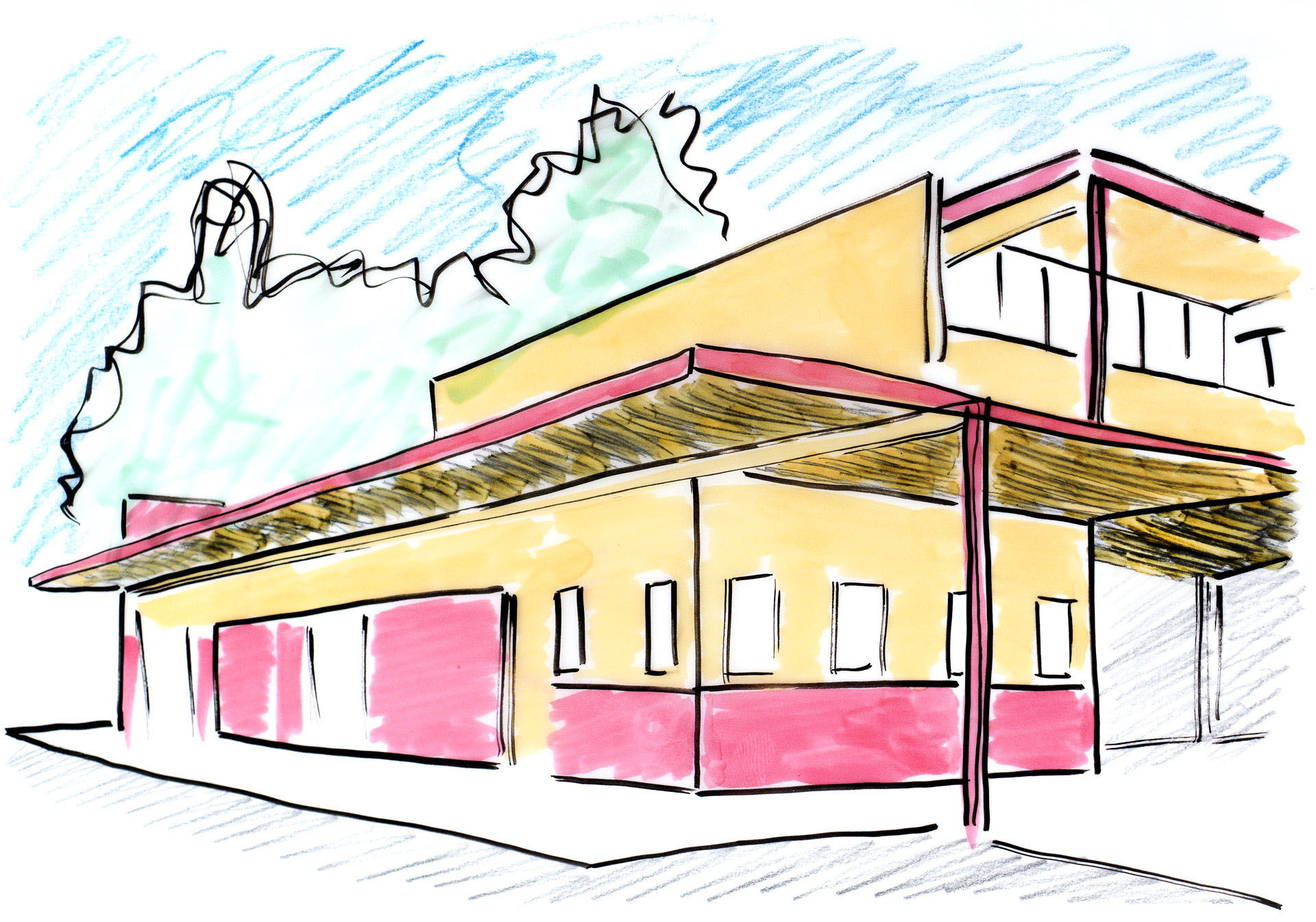
Absolutely love the colors at Luther Burbank Middle School in Highland Park. Judging from historical Google street views, the building was repainted from a drab brown (or raw brick?) sometime during the pandemic.
The building seems to date to 1975, and was designed by Mal Gianni & Associates, a firm specializing in school construction. The New Formalist vocabulary is interesting, though so much more interesting in the bright colors it sports today, particularly on the tiny columns holding up the small arcades.
Saw this weird old modern with an incredible sun breaker across the street from my dermatologist’s office in Arcadia: 75 N Santa Anita Ave.
Not a lot online but apparently designed by a local Arcadian architect named Richard K. Weimer. This building (early 1960s), perhaps once housed his office.
A post on loopnet advertises the whole complex as a tear-down.
I spend a lot of time driving east and west along Foothill Blvd.
In some ways, that 35-mph stretch between Arcadia and Monrovia is the entire basis for this blog: every time I make the drive, I look out for a few minor modernist buildings along the way, all done by mid-century USC grads: a barrel-vaulted church by Smith and Williams, a low-slung dentists’ office by Robert F. Gordon, and a lovely little office building with a vintage sign on the front facade: 160 E. Foothill.
Having lived near Occidental College for a number of years, I was always struck by the little chapel near its entrance. A smooth white-ish building. Every wall is curved, though I wouldn’t say every wall is a curve. More like a rectilinear building that’s been rounded, like a rounded font. Actually that’s exactly what it is: a rectilinear cruciform church that’s been worked over with rounded edges. Is curvilinear the word for that?
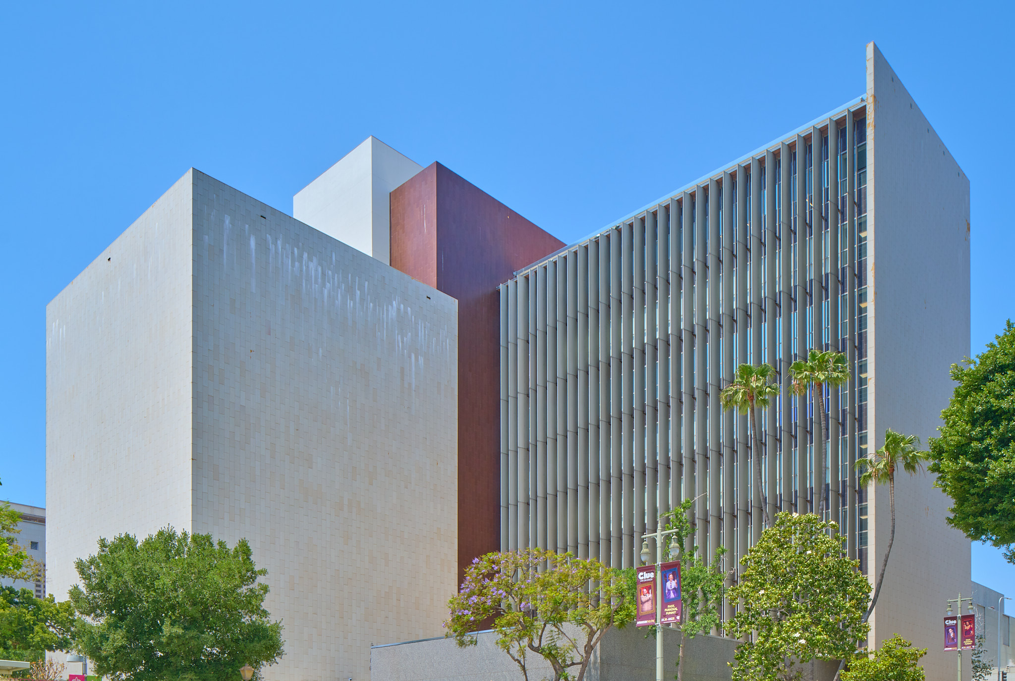
Finally made it down to La Jolla to see William Pereira’s Geisel Library. (Or was it Gin Wong?)
Not a cheap or thin building, but a really incredible one. Exterior is a 10/10. Very evil-headquarters when approaching from the north and the hulking thing first reveals itself from behind the trees, but then the closer you get the less evil it seems.
When I saw Koenig House 2 pop up on modernist real estate Instagram, my first thought was: is there going to be an open house? I’d read about the house before, in the two Koenigbooks I have, though as a house from 1985, it falls outside his “heroic” period of the late 1950s and early 1960s, when his steel frame houses began popping up around Southern California and — most notably — in the pages of Arts & Architecture and its Case Study House program.
His most well-known house is undoubtedly the much-filmed and much-publicized Case Study House 22 (The Stahl House) of 1960, which hangs over a cliff in the Hollywood Hills, though the house that made the biggest impression on me when I first leafed through a book on the Case Study House program was 1958’s CSH 21, the Bailey House, an incredibly simple little structure that contrasts a deep-black steel frame with bright white steel walls and roof. Stark, really, and made only more so by its lack of overhanging eaves.
Anyway, I’d never been in a Koenig house, so when I saw that there was going to be an open house, I knew I had to try and make it there.
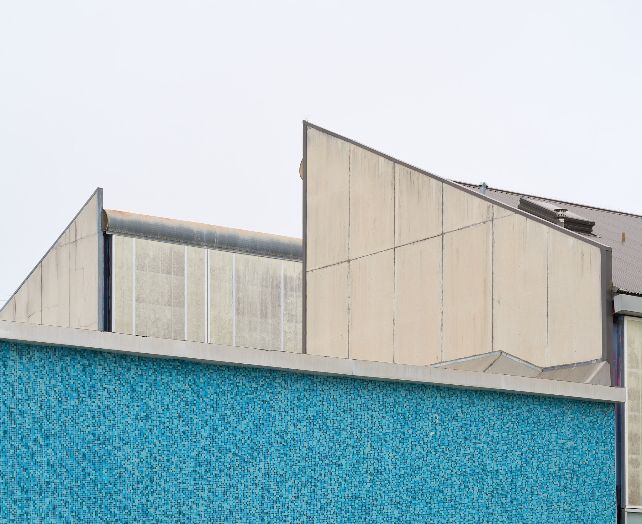
When visiting Neutra’s basketball court, I’d never thought much about the building just up the hill. I’d noticed the great big painted letters on the exterior, sure, I’m always looking out for letters.
This last time I went to visit the Neutra and after I had taken a few photos, I started walking to my car and turned to look back down at the Neutra from a distance, but what caught my eye wasn’t the red building down the hill, it was the blue building right next to me — its northwest elevation, specifically, not the southeast one I’d seen before. Gosh, what a lovely building! A beautiful little steel structure joined with a pair of concrete block ones. Almost kind of high-tech looking, with little spider-leg support nods to Neutra.
So I quickly walked around the building and snapped some iPhone photos, all the while wondering: who designed this little blue gem?
We must’ve been looking for a place to walk our neurotic dog. I can’t think of any other reason why we would’ve ended up at the Eagle Rock Rec Center in 2016, to take a walk on the big field that stretches out below the building pictured above. I must’ve wondered who designed the building, since I’ve known Neutra designed it for as long as I’ve known about the building, but back then — when “Neutra” was just a name I remembered from an architectural history survey course — it wouldn’t have meant much.
What struck me then was how dilapidated the whole thing was. Crumbling concrete, peeling paint. Not tragically dilapted, just… kind of cruddy, in an oddly exciting way. Here was an architect mentioned in every 20th century architectural history textbook you can find, and yet, here was an incredibly normal building that people played basketball in. No fences, no guards, no tickets. Just a Neutra, next to some tennis courts, above a baseball field.
NoteThis blog was originally called “Cheap & Thin,” but the more I’ve posted here, the more that (A) I’m writing about buildings that aren’t particularly thin (as they’re made of concrete), and (B) I’m writing about little known architects whose descendents might not be flattered by their work being implicitly described as “cheap.”
“Cheap and thin.” That’s how Frank Lloyd Wright famously described Richard Neutra’s Lovell Health House in 1932. It’s a criticism I love not only because it illustrates how much of a dickhead Frank Lloyd Wright was, but also because it’s accurate: Neutra’s houses were cheap and thin.
And not by mistake. His designs, and the many more those inspired, were intentionally cheap and thin.
Once upon a time, in a small village in rural France, I walked with two architectural history professors on a narrow road. Our shoes crunched on the gravel for a while until one professor stopped to look up at a small rustic building. You see that beam there? We turned to where he was pointing. Amazing to think that’s how they did that. The other professor agreed and they started to discuss the beam in great detail.
This was the summer after I had just graduated with a bachelor’s degree in architectural history. The two professors were there in France to photograph Gothic churches, and I was there as an assistant. It was an unforgettable three weeks; the cathedrals we visited were some of the most incredible spaces I’ve ever entered. But as I stood there on that road looking at that beam, I knew I could never muster that kind of passion for buildings, and made a mental note to cross “Architectural historian” off my list of possible careers.