Details at Geisel Library
William L. Pereira & Associates • 1970 • La Jolla, California
Sigma fp L • Nikon Nikkor 50mm f/1.8
415 words • 11 images
Finally made it down to La Jolla to see William Pereira’s Geisel Library. (Or was it Gin Wong?1)
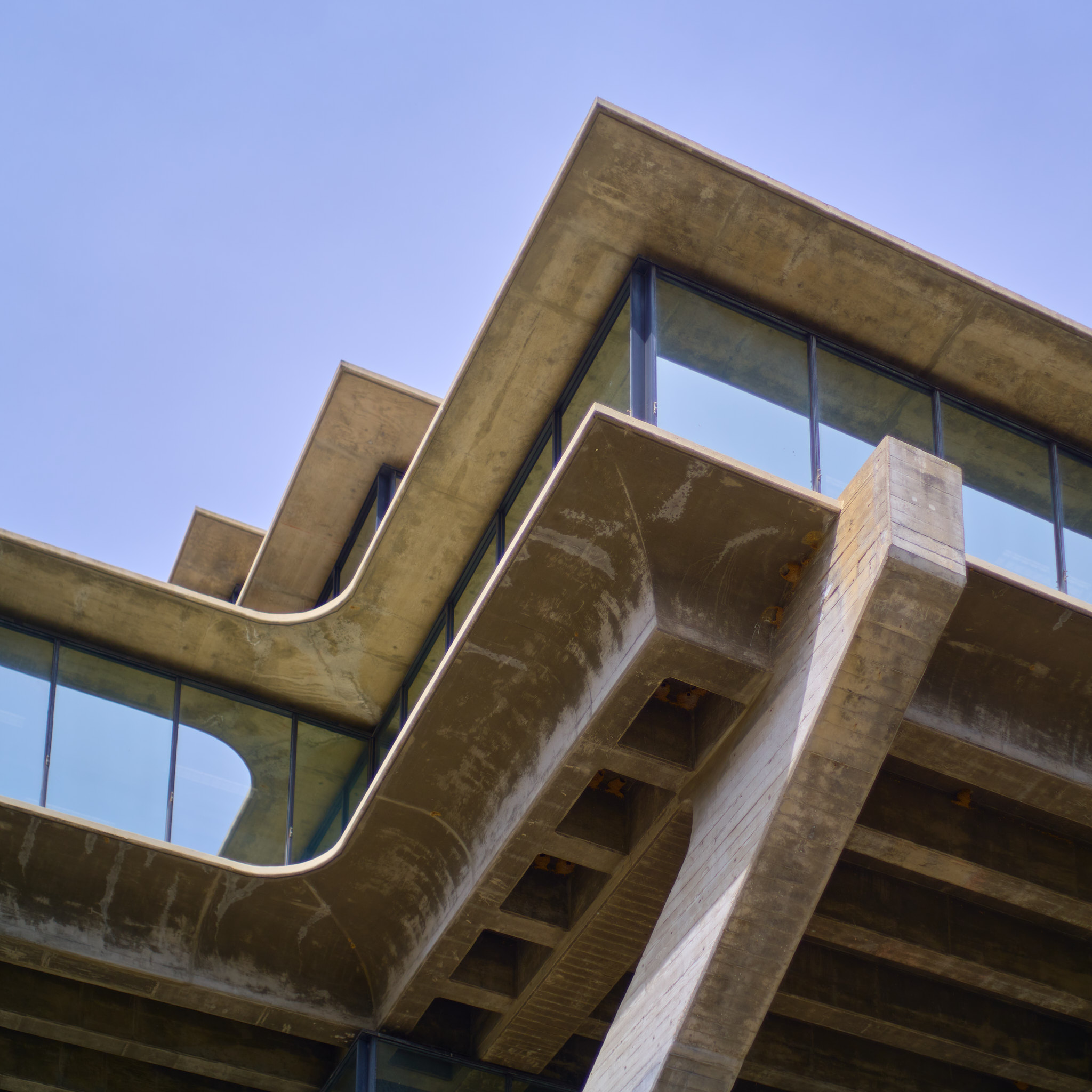
Not a cheap or thin building, but a really incredible one. Exterior is a 10/10. Very evil-headquarters when approaching from the north and the hulking thing first reveals itself from behind the trees, but then the closer you get the less evil it seems.
•••
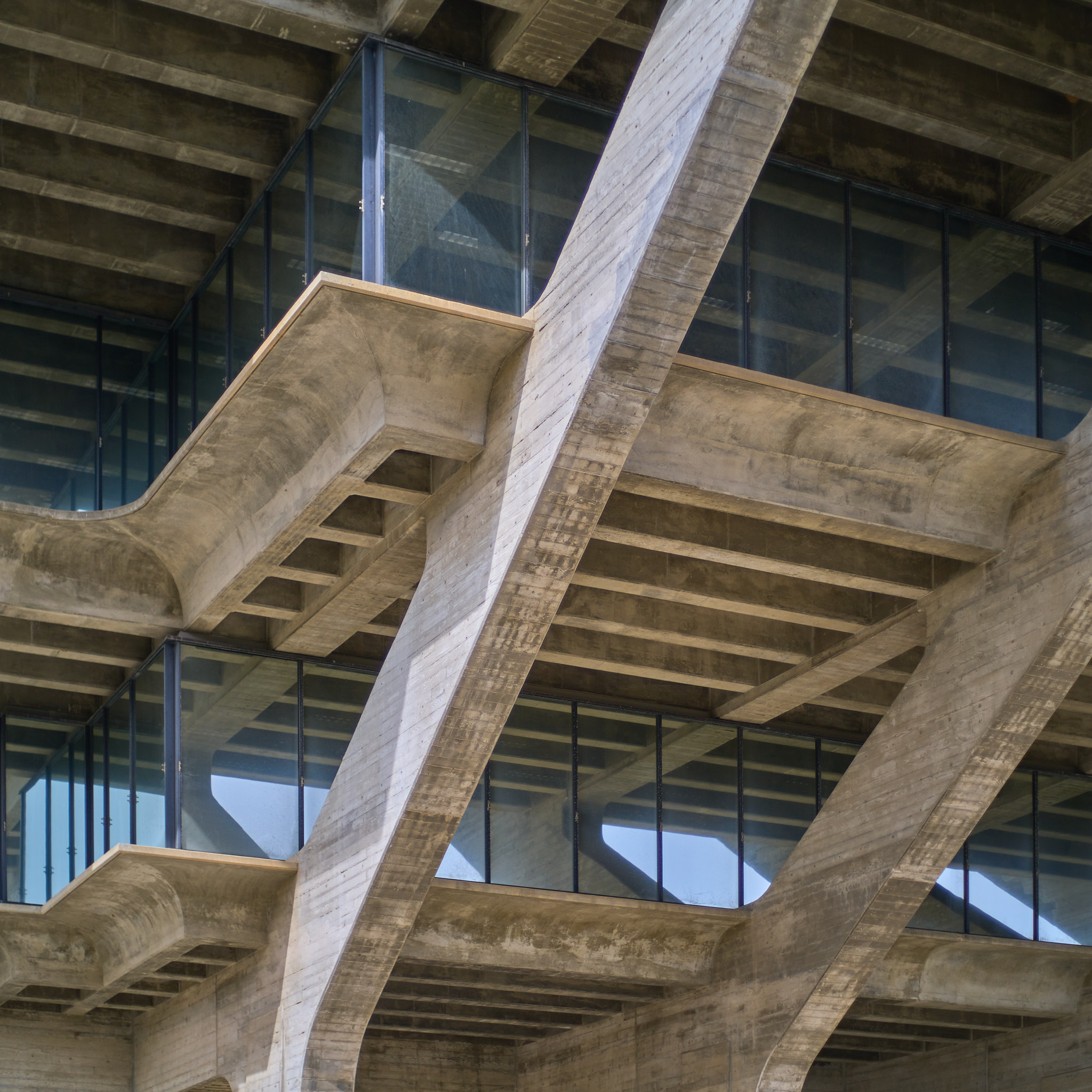
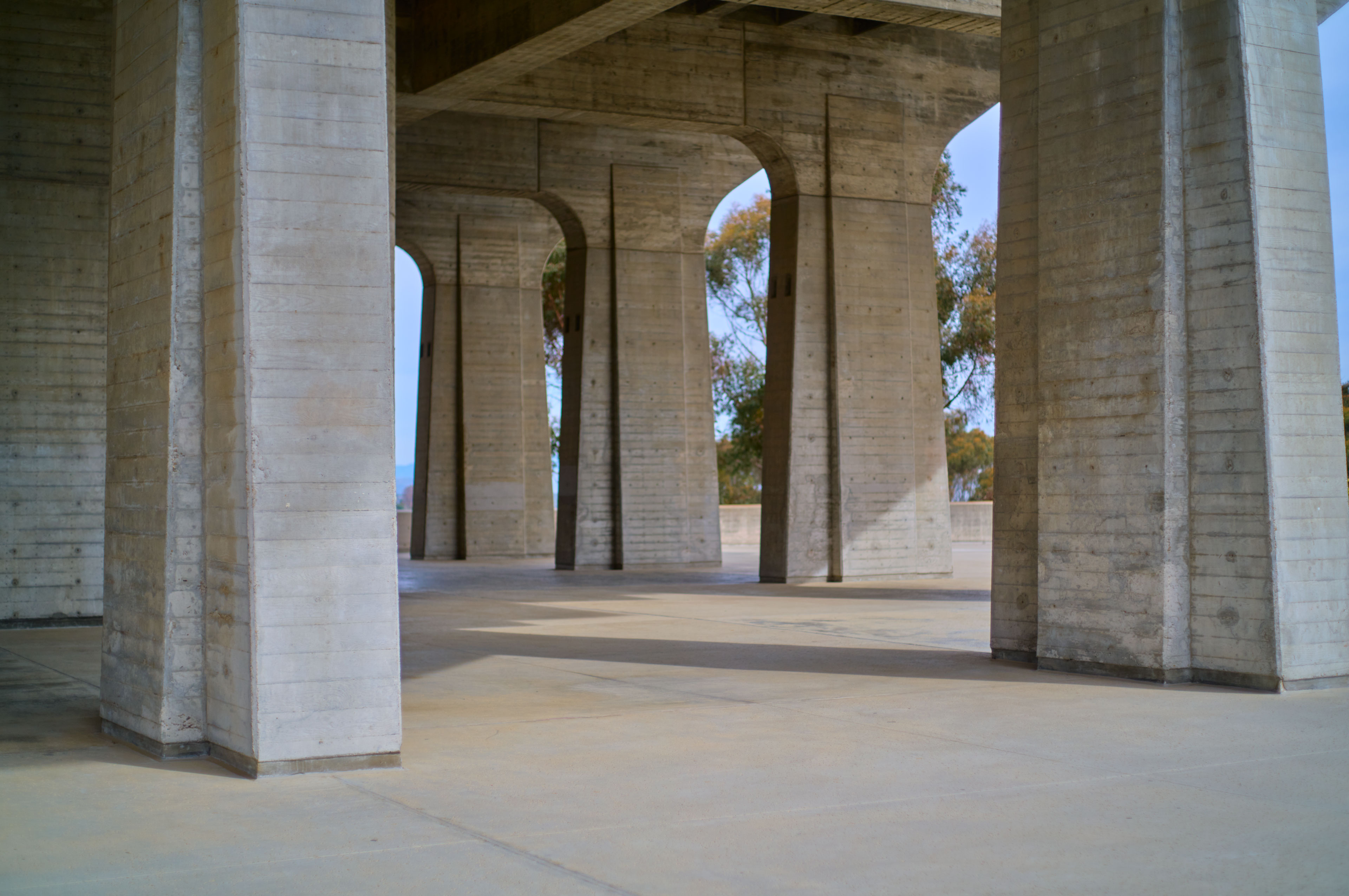
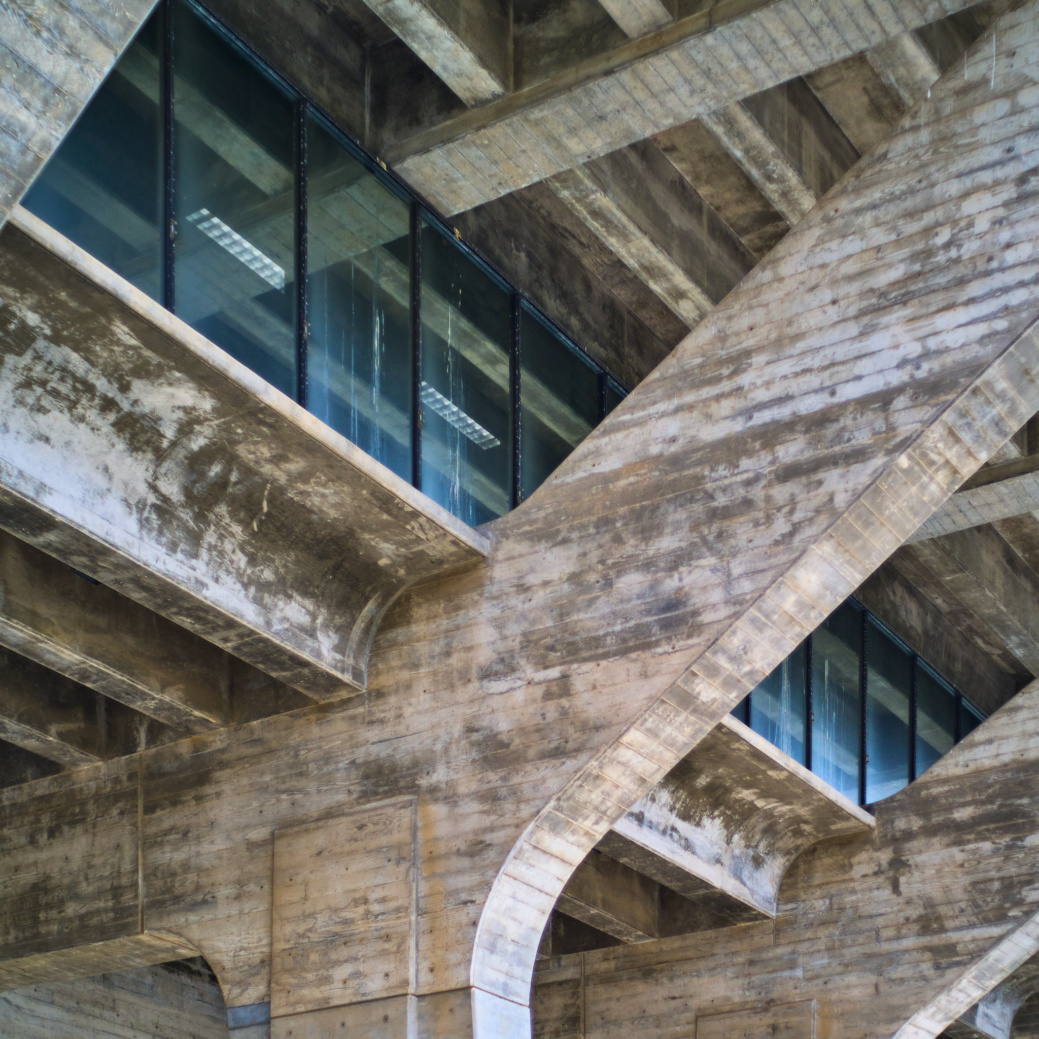
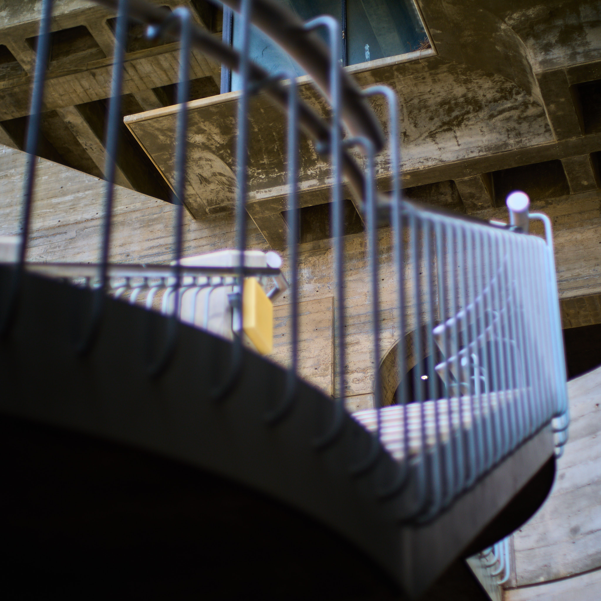
When you get up very close, and look straight ahead, there’s something of a classic colonnade vibe to the concrete supports that arch outward. At their bases, the supports look almost like doric pilasters.
But then when you look up, it suddenly feels like you’re looking skyward inside a Gothic church, like you’re contemplating the vaults, as if the concrete supports were stepping inward to support a roof rather than cantilevering outward to support nothing at all. Or at least that’s how I felt: when you’re under the building and looking out, you’re on the stylobate of a classical temple; but then you look up and you’re inside a church. Quite an effect!
Apparently this was somewhat intentional, the ambiguity between indoor and outdoor space; the concrete plaza is the building’s “third floor” (two below, more above), and was originally intended as the building’s formal event space, though I don’t think that’s the idea any longer. There was a dance troupe filming a video on the plaza when we arrived, which was nice.
Took a medium lens this time — an old Nikon 50/1.8 that seems to be about as old as I am — and mounted it on my Sigma fp L. Fun to know the lens length meant I could really only take detail shots, which is what I did.
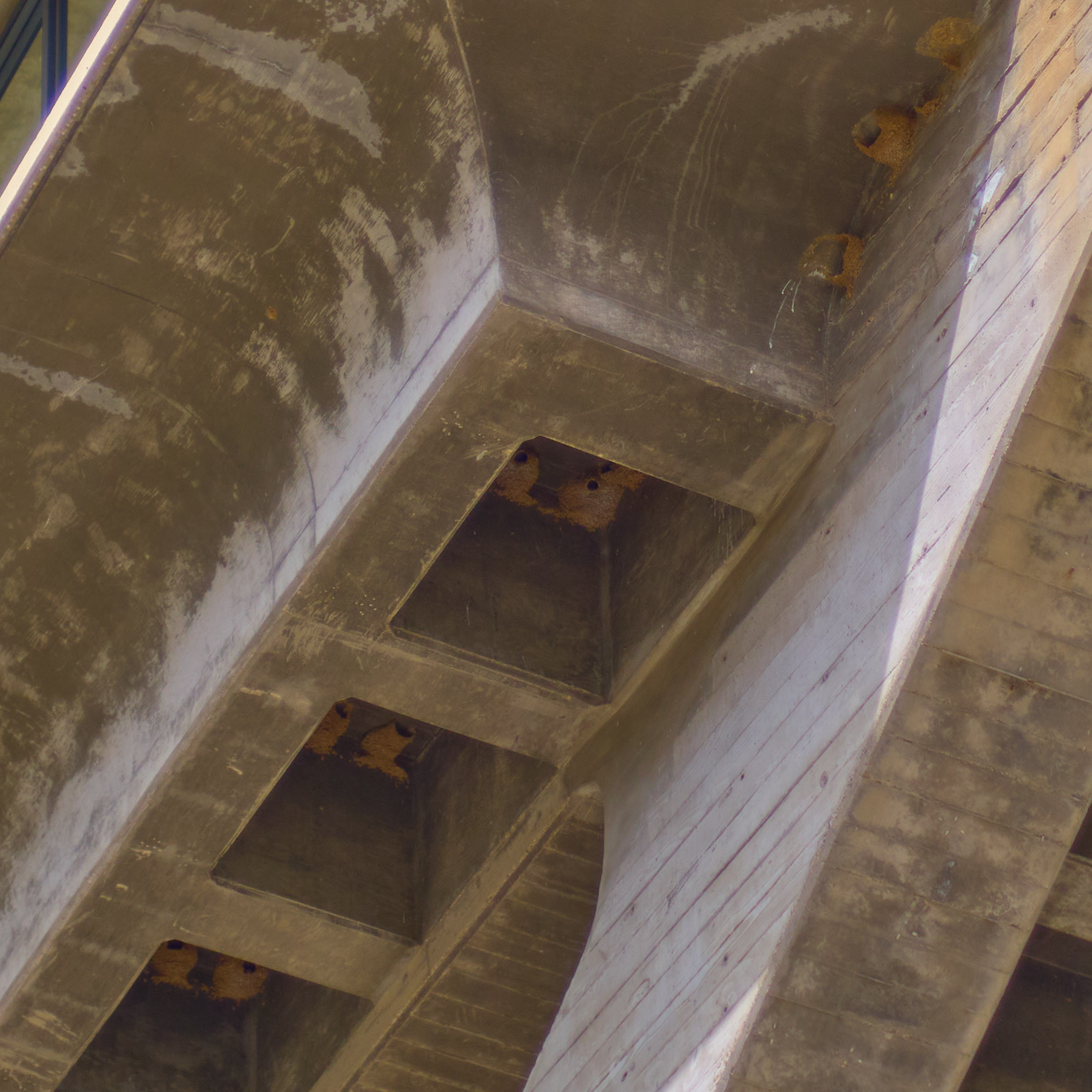
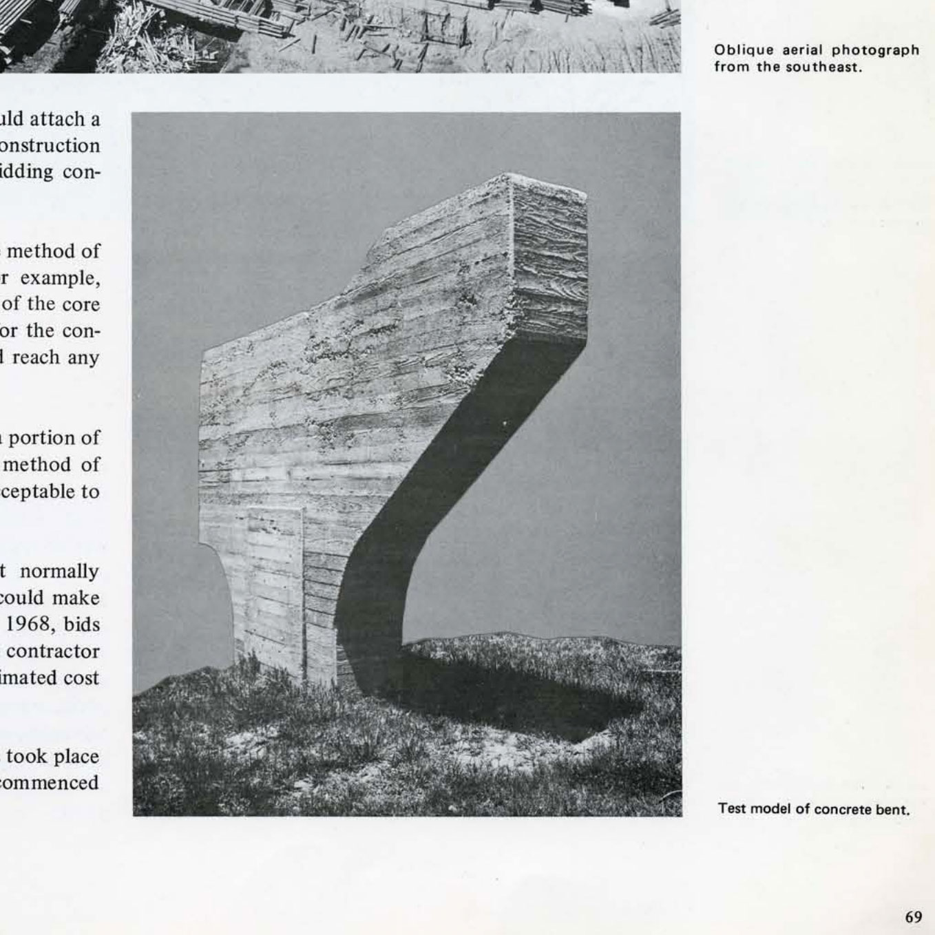
Especially fun to photograph details on a building like this one, given how detailed the impressions of the wooden formwork on the concrete are. Really feels like the inverse of a wooden building. Certainly the kind of building that could never be built in today’s America, given how expensive that kind of custom formwork has become. Or at least I think I heard that somewhere.
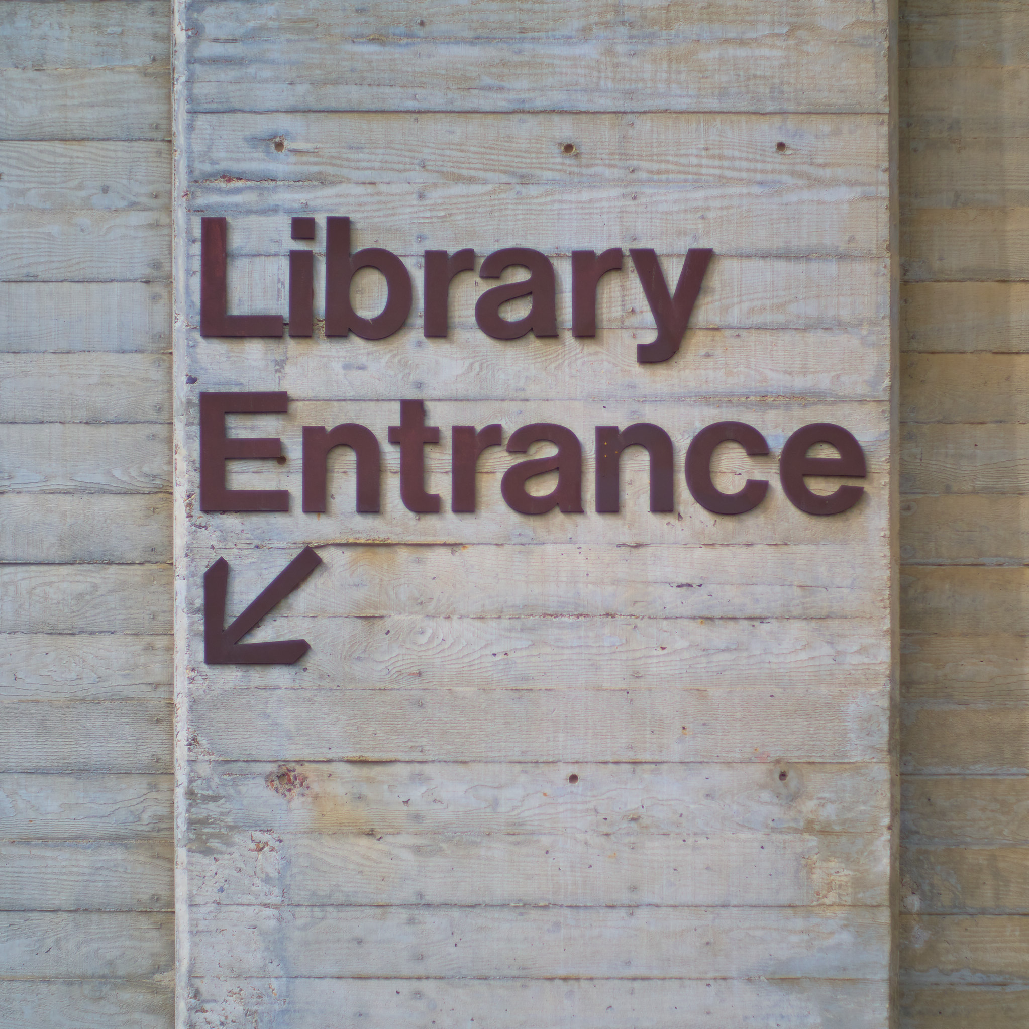
Highly recommend a visit if you’re in the area. And could be easily coordinated with a visit to the Salk Institute across the street, though that would mean you’d have to be there on a weekday (with a prebooked tour).
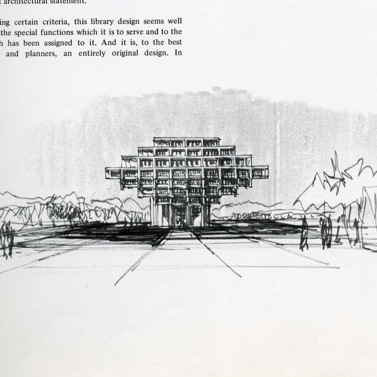
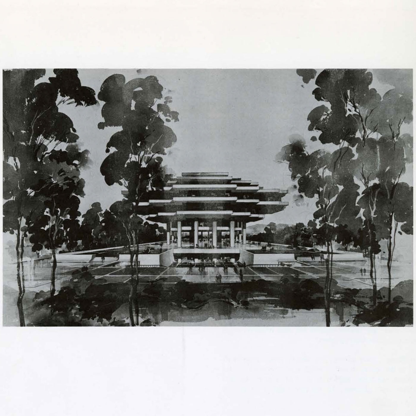
Apparently the building was originally meant to be all steel-and-glass, which definitely would’ve been a different look. Incredibly cool drawings in this report by Pereira & Associates.
-
Some sources (like Wayne Thom: Photographing the Late Modern) say Gin Wong was the architect, though I don’t see that claim repeated in a lot of places. Would love to know more! ↩