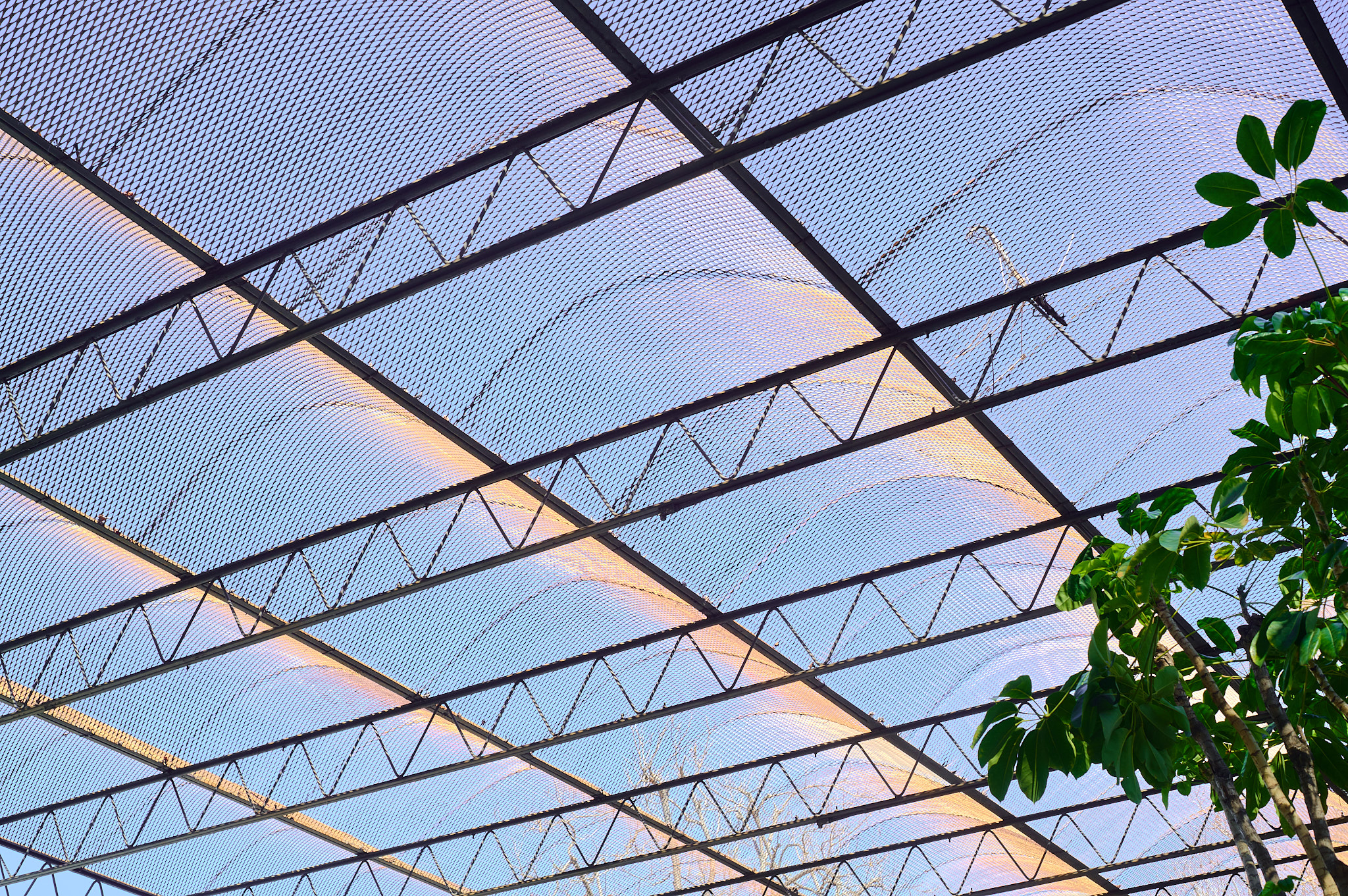
1414 Fair Oaks
Smith & Williams • 1958 • South Pasadena, California
Sigma fp L • Nikon Nikkor 50mm f/1.8
478 words • 9 images
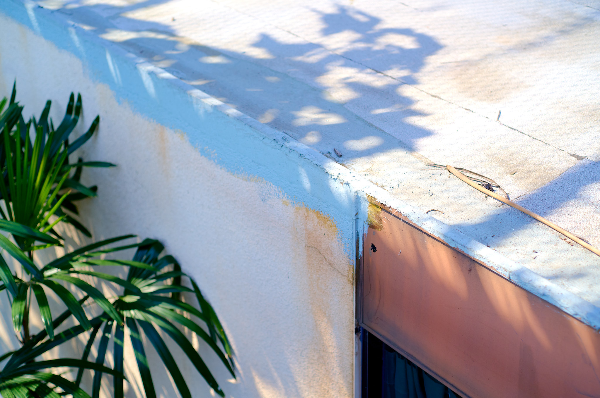
If you’re ever in South Pasadena, make sure to stop in at 1414 Fair Oaks Ave., preferably on a sunny day to get the full effect of the incredible sun breaking metal roof that sits above the loose grouping of mid-century offices.
Once upon 1414 Fair Oaks was the combined offices of the architects Smith & Williams, the planners Eisner & Stewart, and the landscape architects Eckbo & Associates. Together they were a loose collaboration — separate business literally working together under one roof — known as “Community Facilities Planners” (a name so generic it’s almost impossible to remember).
But this building (buildings?) is anything but generic.
•••
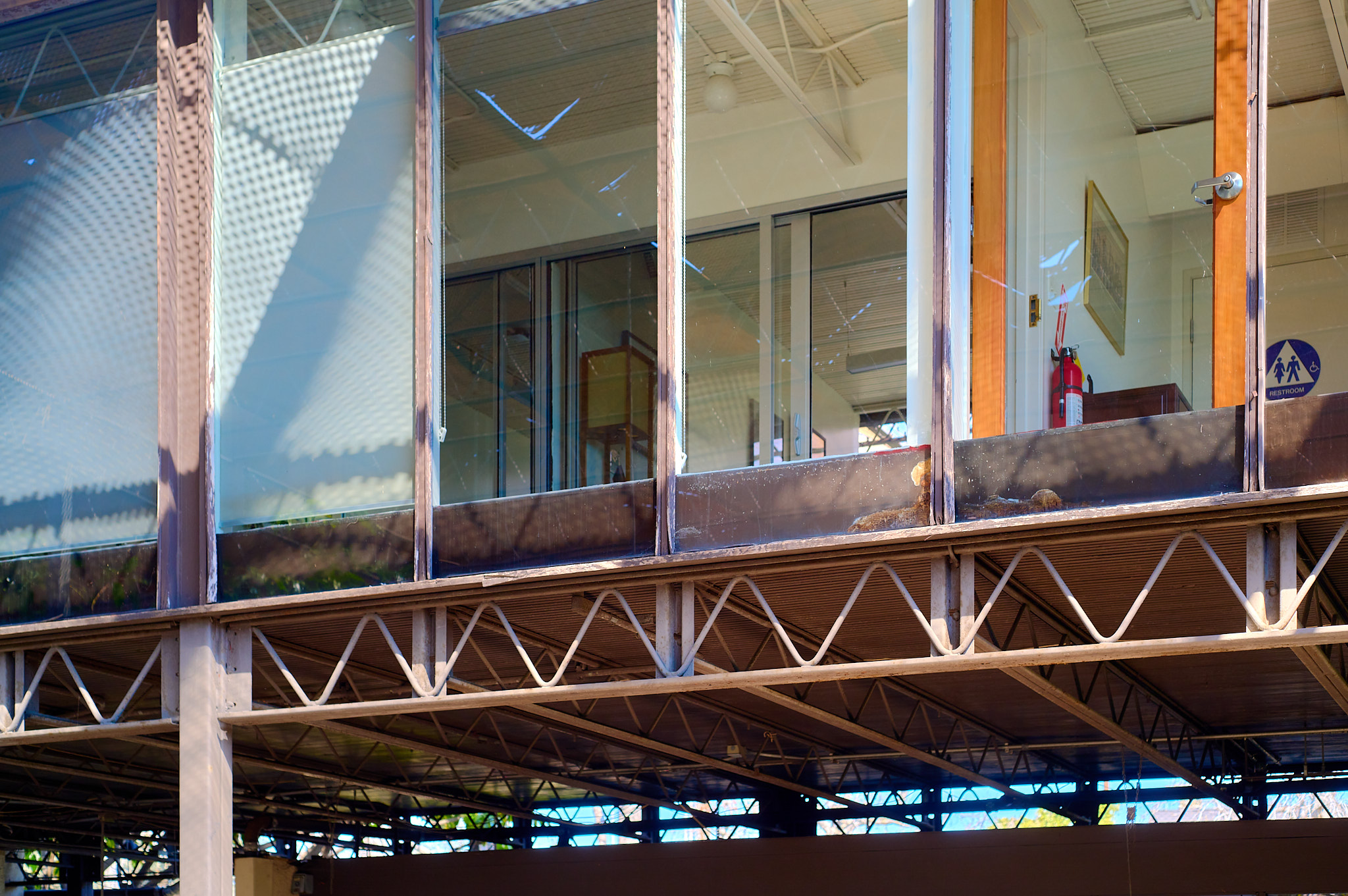
These days it’s a little hard to tell who works there. Definitely some dentists, and at least one after-school program. Perhaps some architects on the second floor? In any event, the building isn’t in fantastic shape, but seems fairly unaltered from it’s original design.
The architectural partnership of Smith & Williams was led by Whitney R. Smith, a USC-trained architect (Class of ’34) known best for his contributions to the early days of Arts & Architecture Case Study program (numbers 5 & 12). Wayne Williams was once a student of Smith at USC, and in 1946 they formed a partnership together.
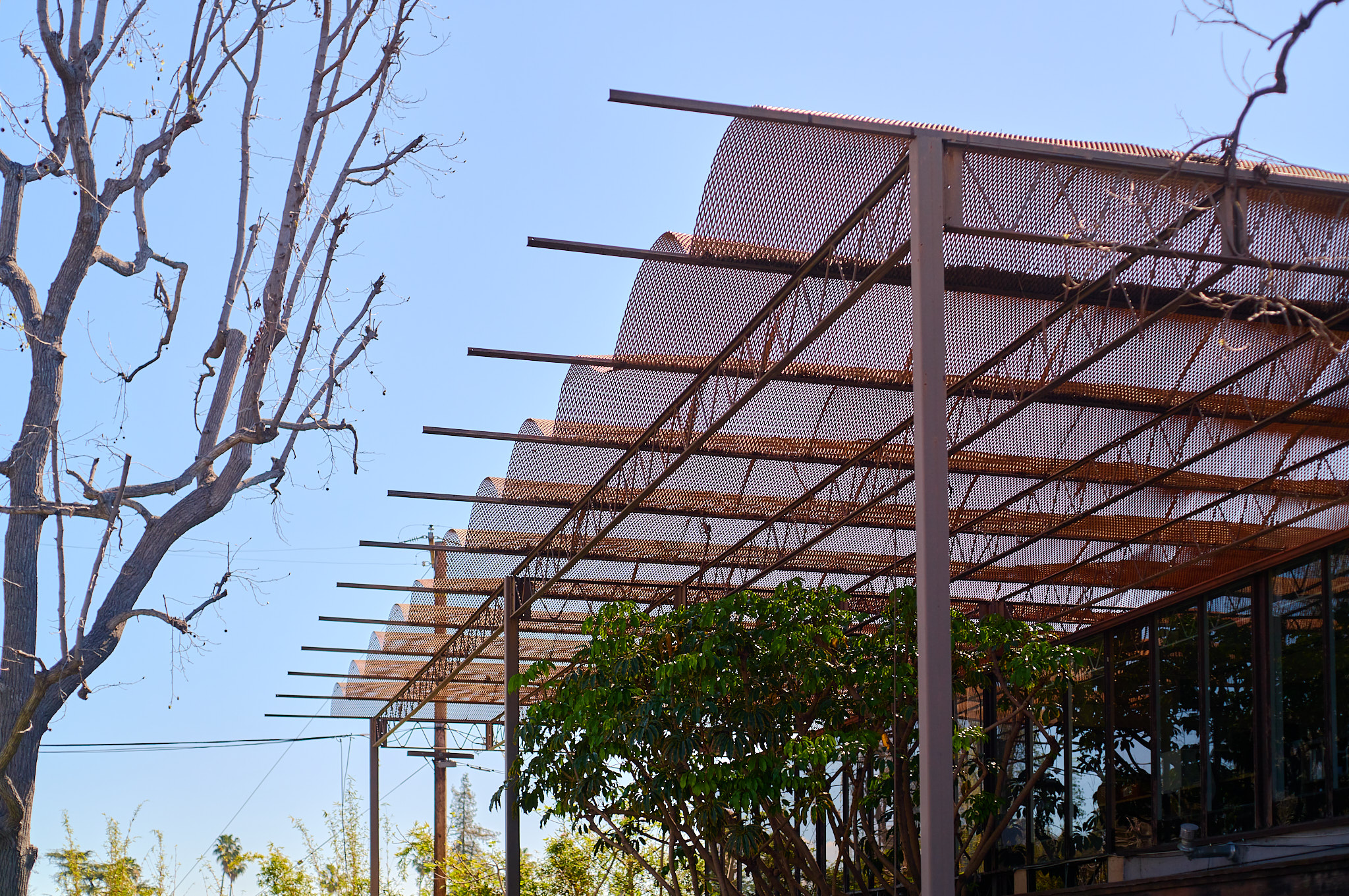
Both were native Southern Californians, which explains the careful attention to sunlight at 1414 Fair Oaks. Many architects would have been content to place a group of low-slung offices in direct sun, but here they’re shielded by the expanded metal lattice canopy. And not just shielded; here everything is dappled in beautiful pin pricks of light (which you can see on the roof in that first picture up top).
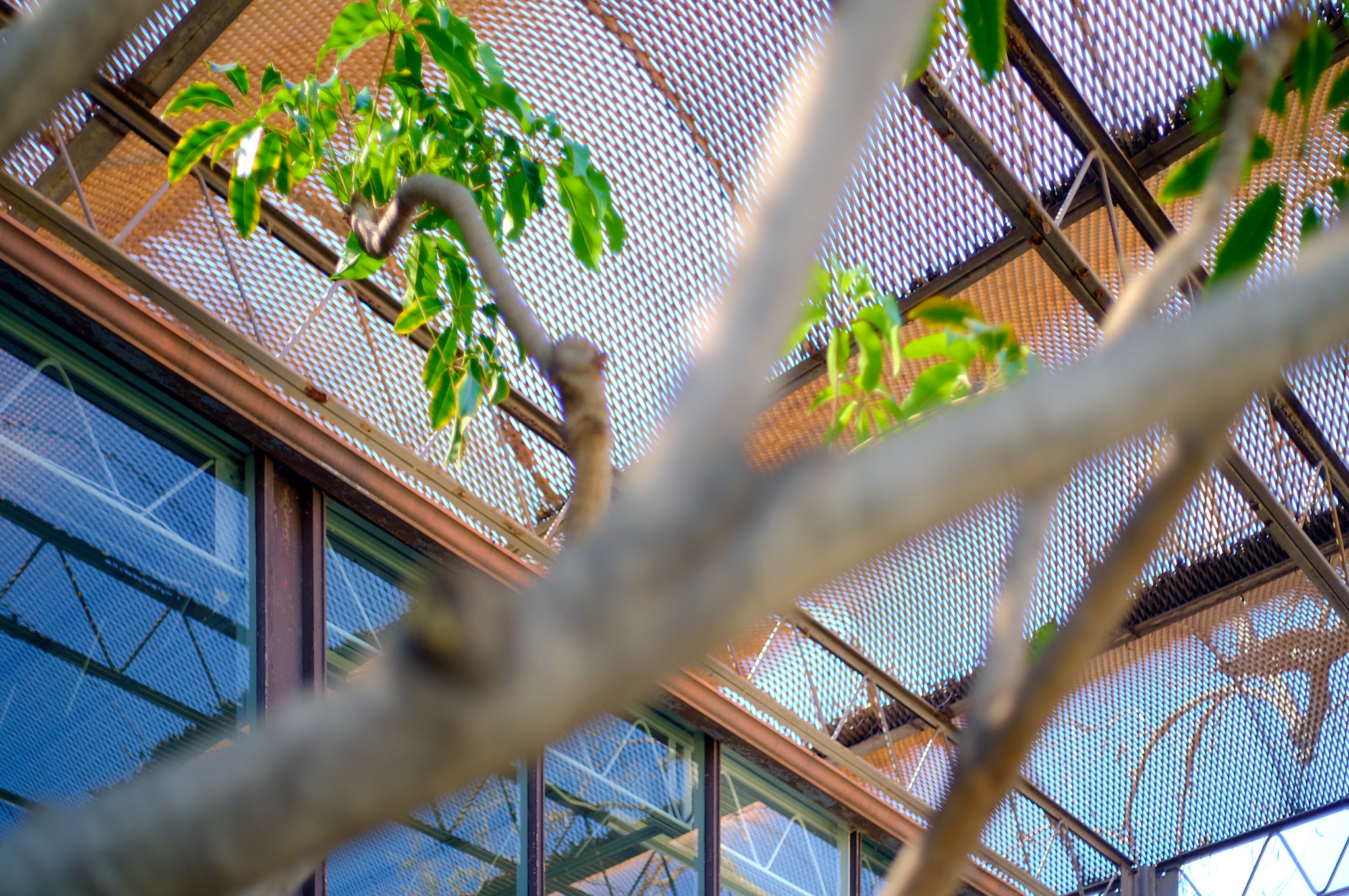
The landscape was designed by Garrett Eckbo, an omnipresent figure in midcentury California. It seems like every time a book bothers to point out who designed the landscape of a midcentury building here, it’s Garrett Eckbo.
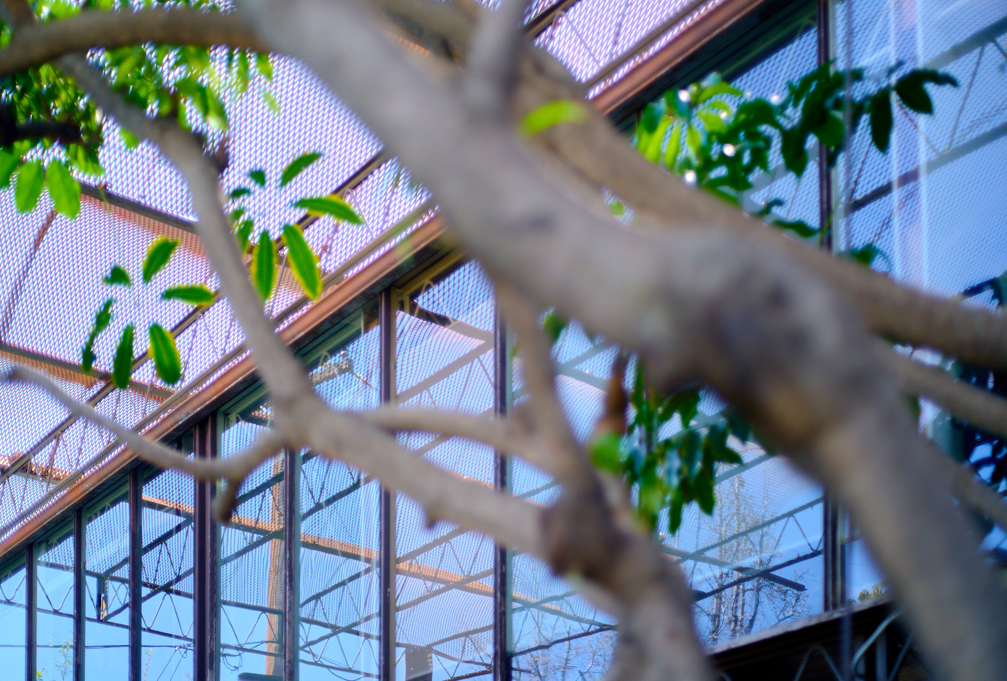
And what a landscape it is. An incredibly embodiment of indoor-outdoor — warmed by the sun but not destroyed. Trees everywhere — beautiful greens contrasting with the many brown and copper tones of the buildings themselves.
Of course, over time, it appears much of the interior landscape has been simplified. Gone are the fountains pictured in period photographs. Gone are the little reflecting pools. (This was pre-mosquito Los Angeles, after all.)
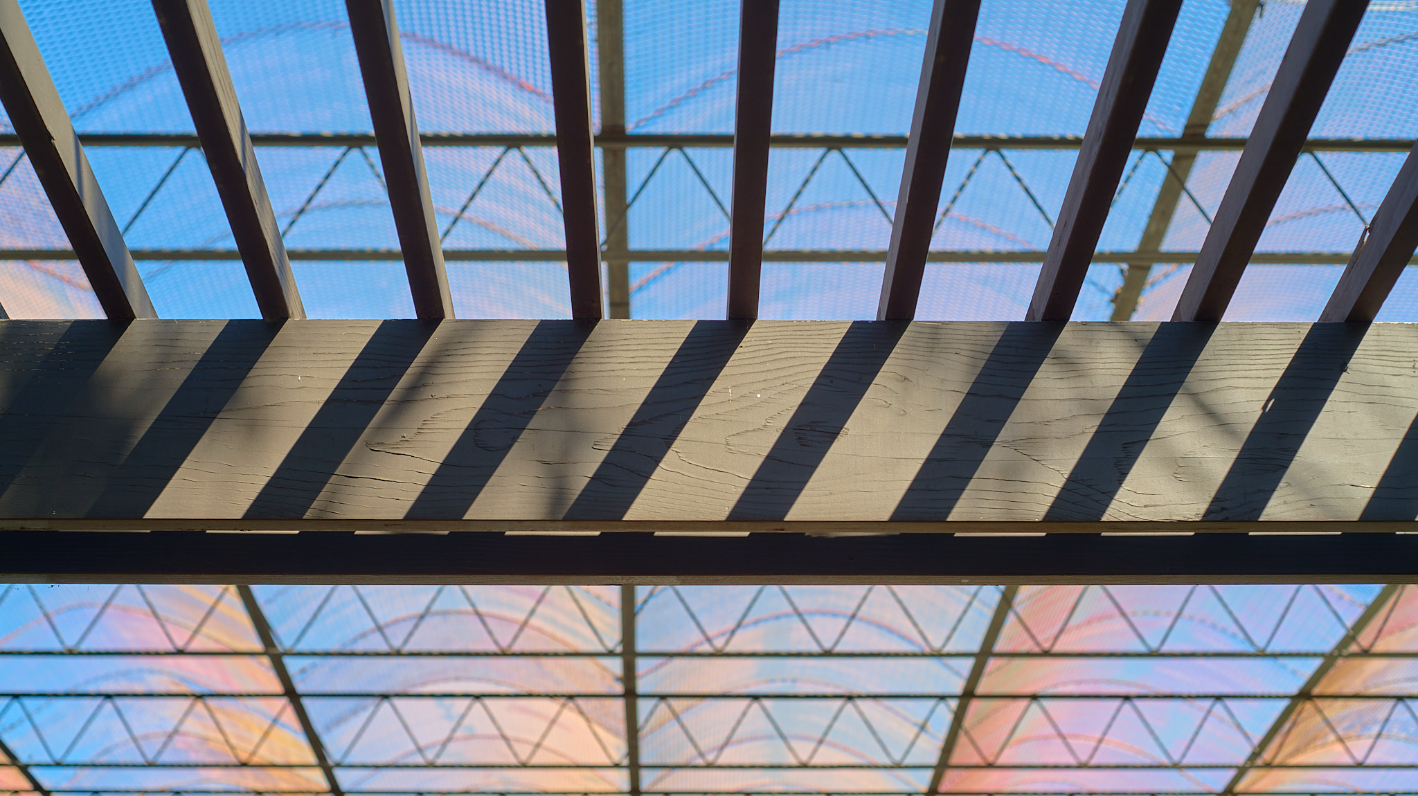
As you can perhaps tell, the color rendition in these photos is all over the place. I’ll admit this was before I turned Auto White Balance off on my camera, but there’s something else at play here: the fine mesh of the roof canopy has such an effect on the light, every time you look up from a different angle, everything seems different.
Look straight up and the sky is completely blue.
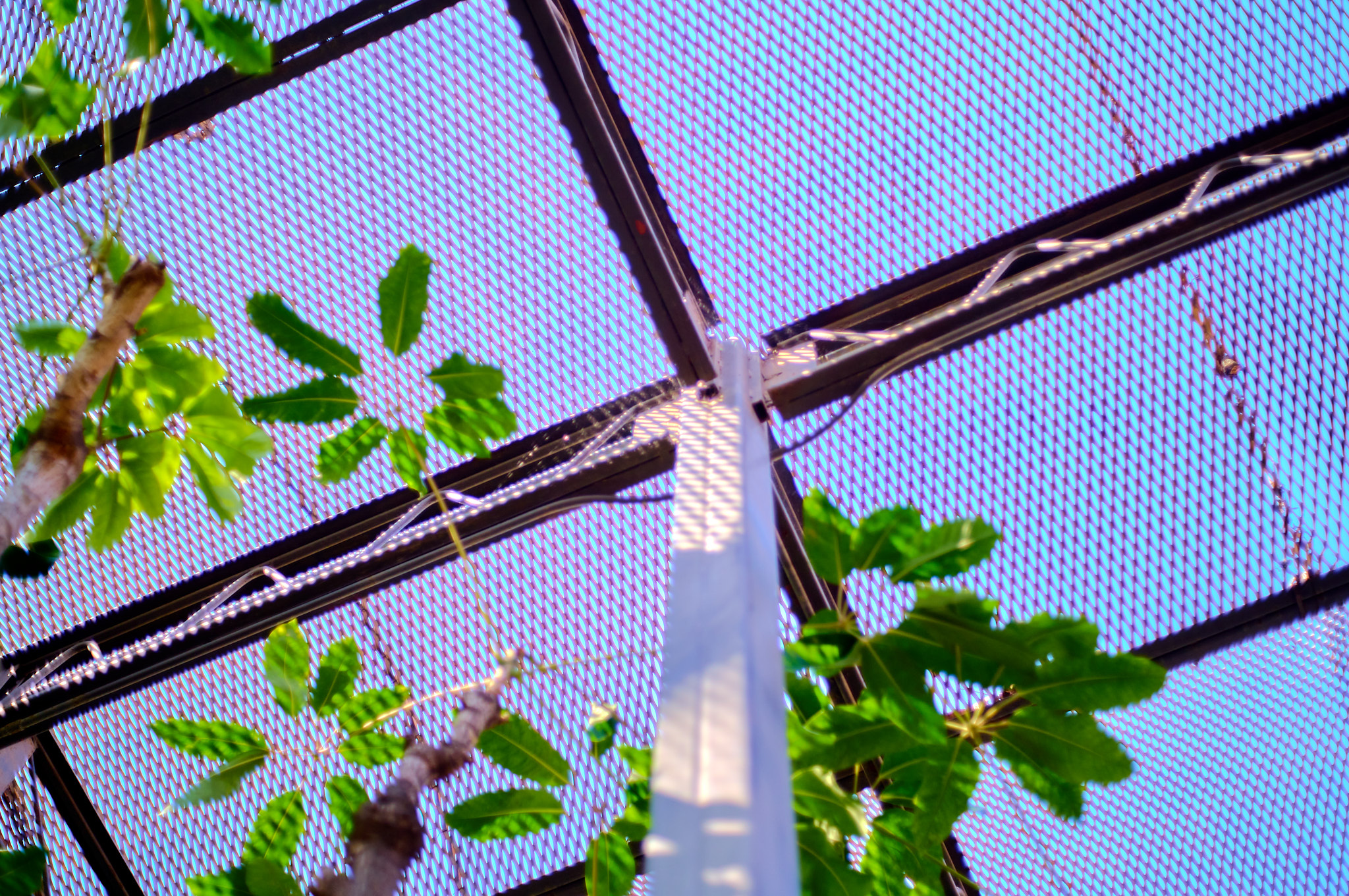
Look out towards the horizon and you’re inside under a solid copper roof.
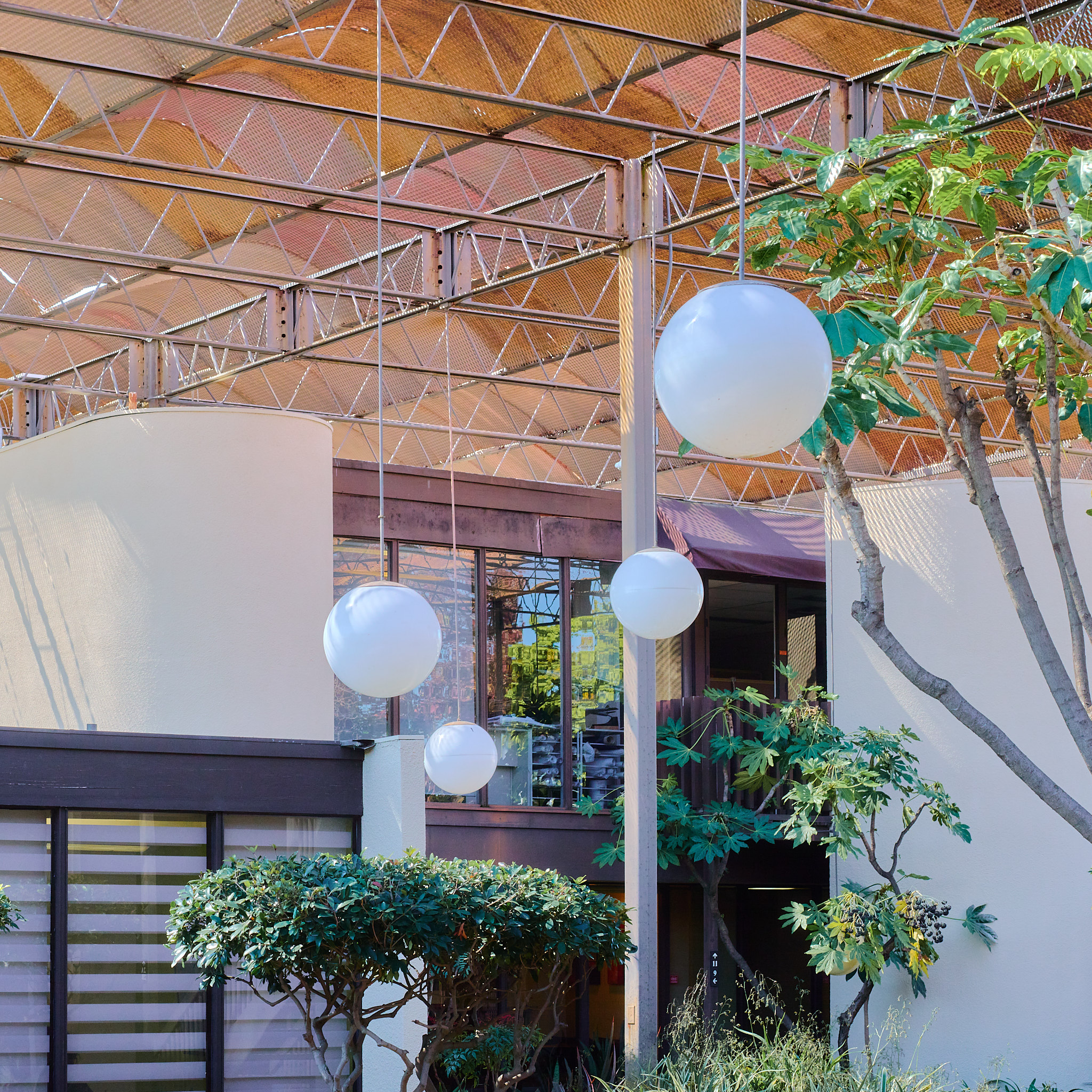
Look between them and you experience both at once.
