Ladd & Kelsey’s Herrick Chapel
Ladd & Kelsey • 1968 • Eagle Rock, California
Sigma fp L • Nikon Nikkor 50mm f/1.8
441 words • 8 images
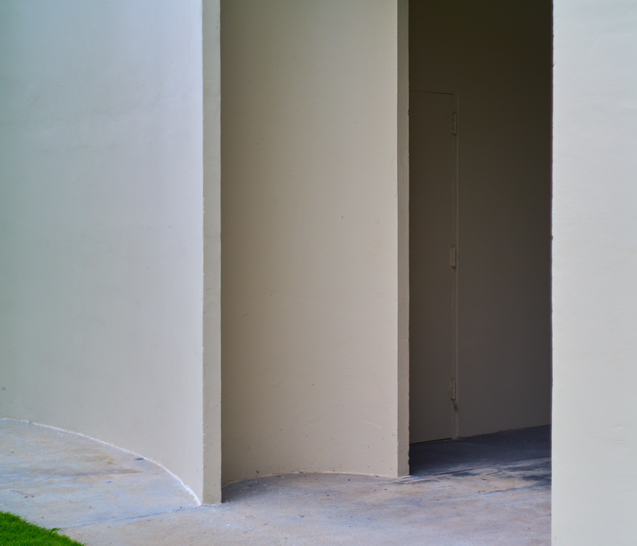
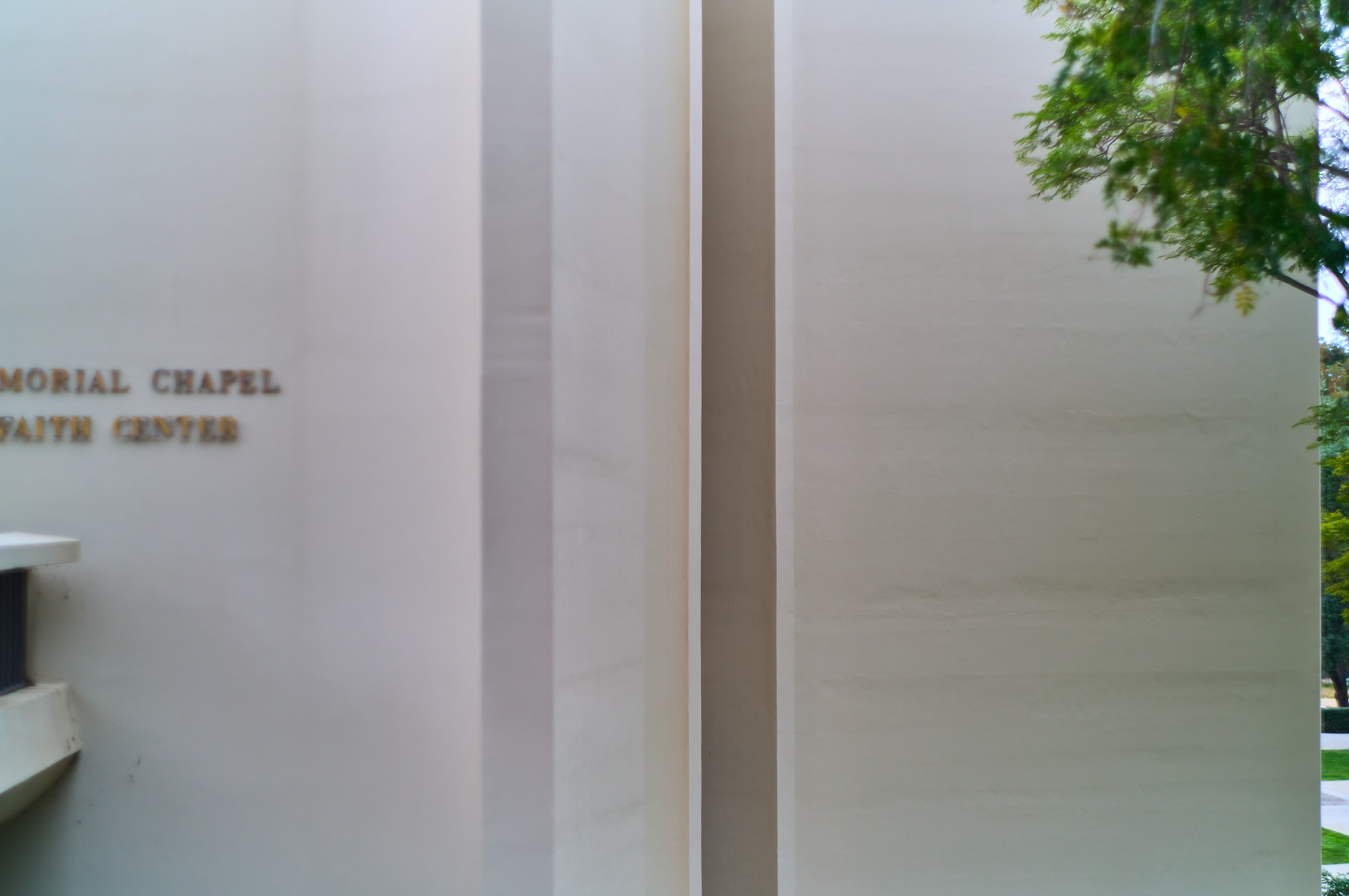
a gathering of curved walls on the southern elevation
Having lived near Occidental College for a number of years, I was always struck by the little chapel near its entrance. A smooth white-ish building. Every wall is curved, though I wouldn’t say every wall is a curve. More like a rectilinear building that’s been rounded, like a rounded font. Actually that’s exactly what it is: a rectilinear cruciform church that’s been worked over with rounded edges. Is curvilinear the word for that?
•••
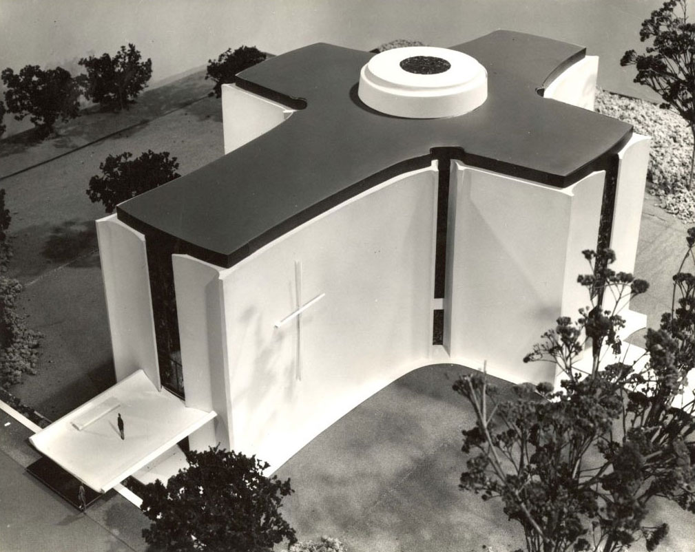
The 1968 design is by the midcentury USC graduates Ladd & Kelsey, a pair probably best known for the nearby Norton Simon museum, which was completed the next year, though under its original name: the Pasadena Art Museum. That building — like LACMA across town — didn’t find a lot of fans when it first opened. Many seemed to think the low ceilings and curvilinear interior walls fought the installations. But then in the 90s the original building’s rounded corners and WASPy formalism was stripped away by Frank Gehry, Gensler, & Nancy Goslee Power, leaving a building I like quite a bit; the huge skylights and winding garden path are both very lovely.
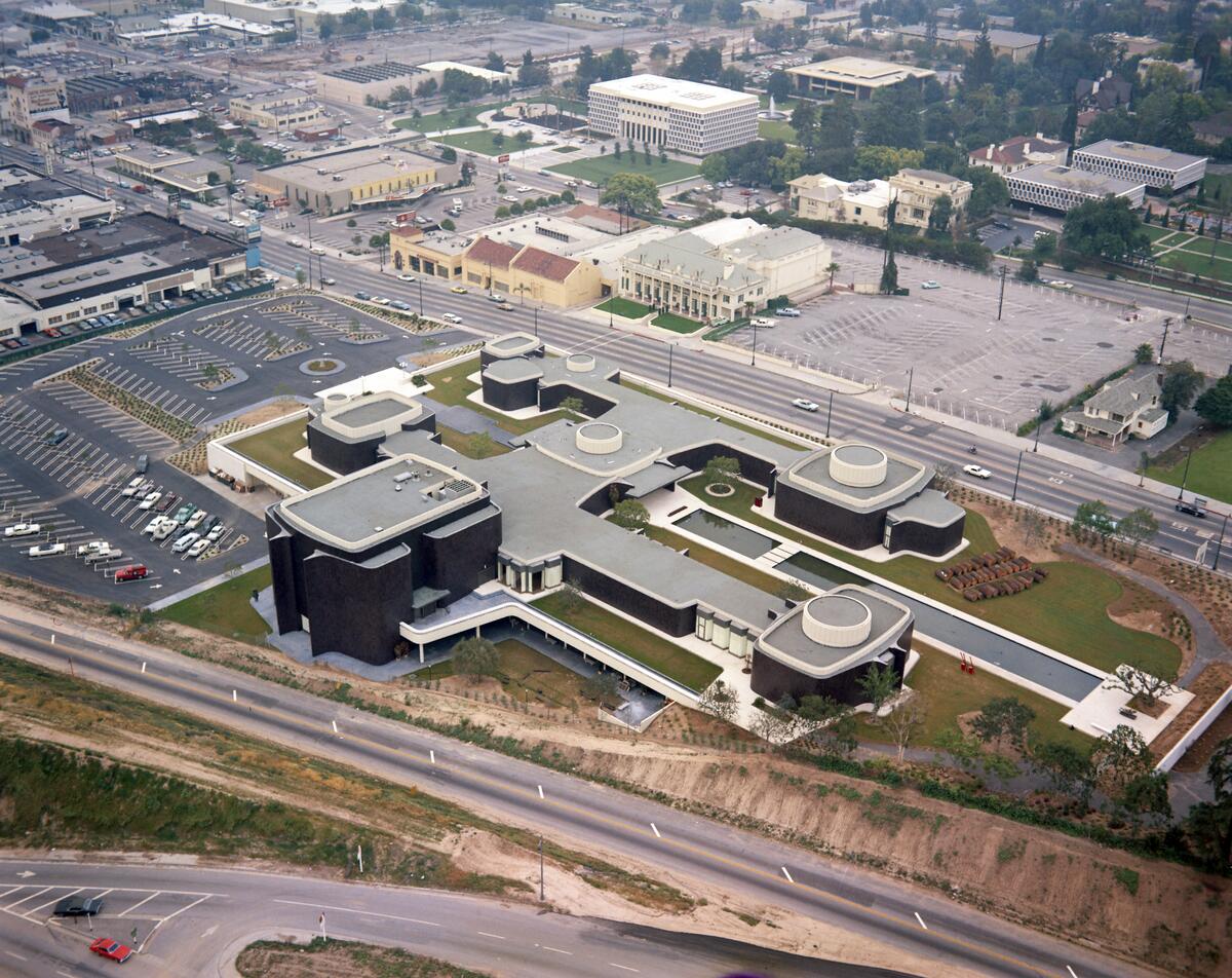
All of that is to say: the Herrick Chapel is a kind of mini, untouched Norton Simon. Well, untouched apart from the name. Like Occidental itself, today’s the building is no longer an exclusively Christian building — it’s the Herrick Interfaith Center, so the huge crosses have been removed from the north and south elevations.
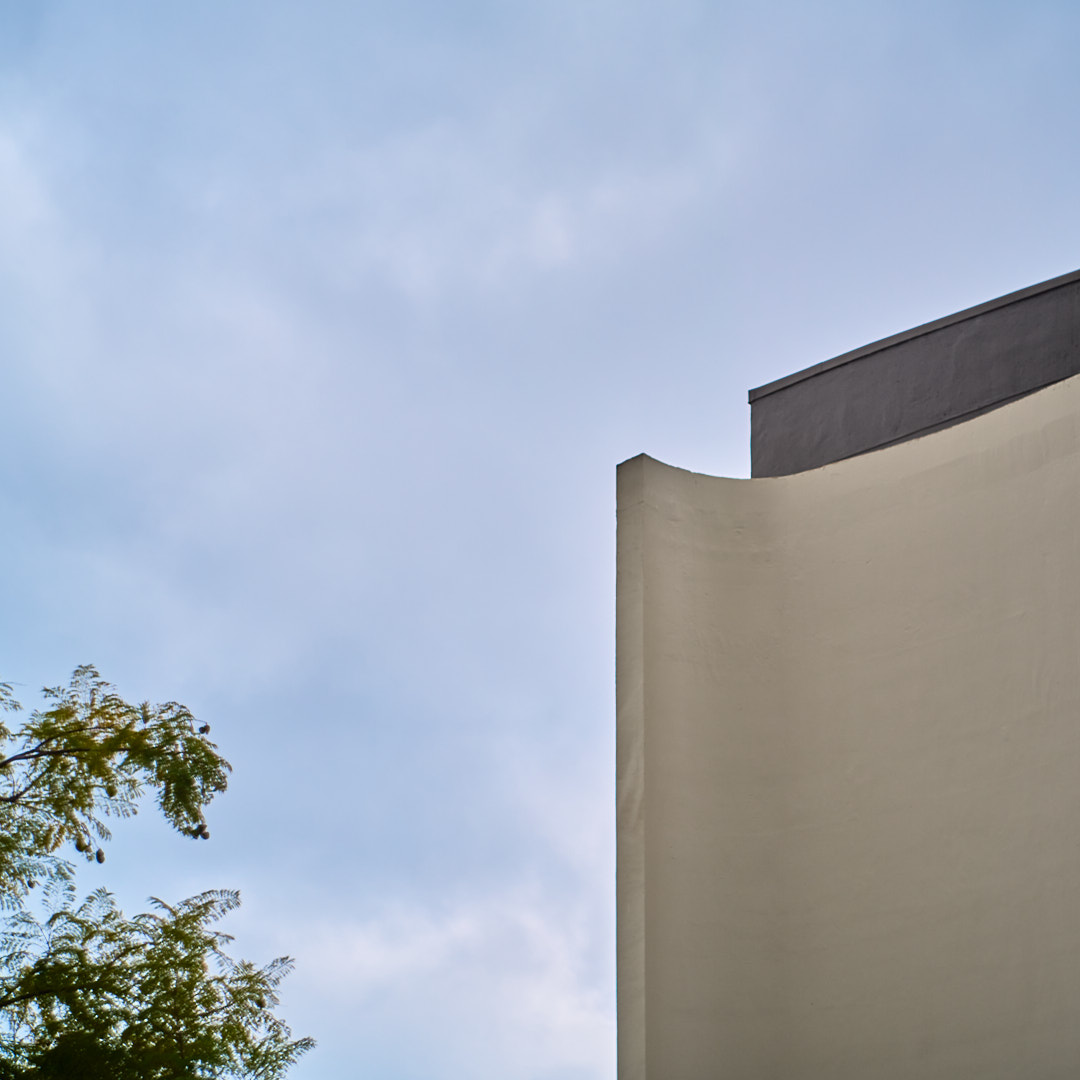
It is a nice building, though it was incredibly hard to photograph, especially since it’s so close to other buildings — and I only had my 44mm Helios on my Sigma fp L.
Though one wonders if both this chapel and the Norton Simon are just difficult to photograph. The curving walls become incredibly abstract when you’re attempting to frame them in a view finder. Even more so when the sky is grey and the aperture is wide open, as in the photograph below. An almost dream-like quality to the whole experience.
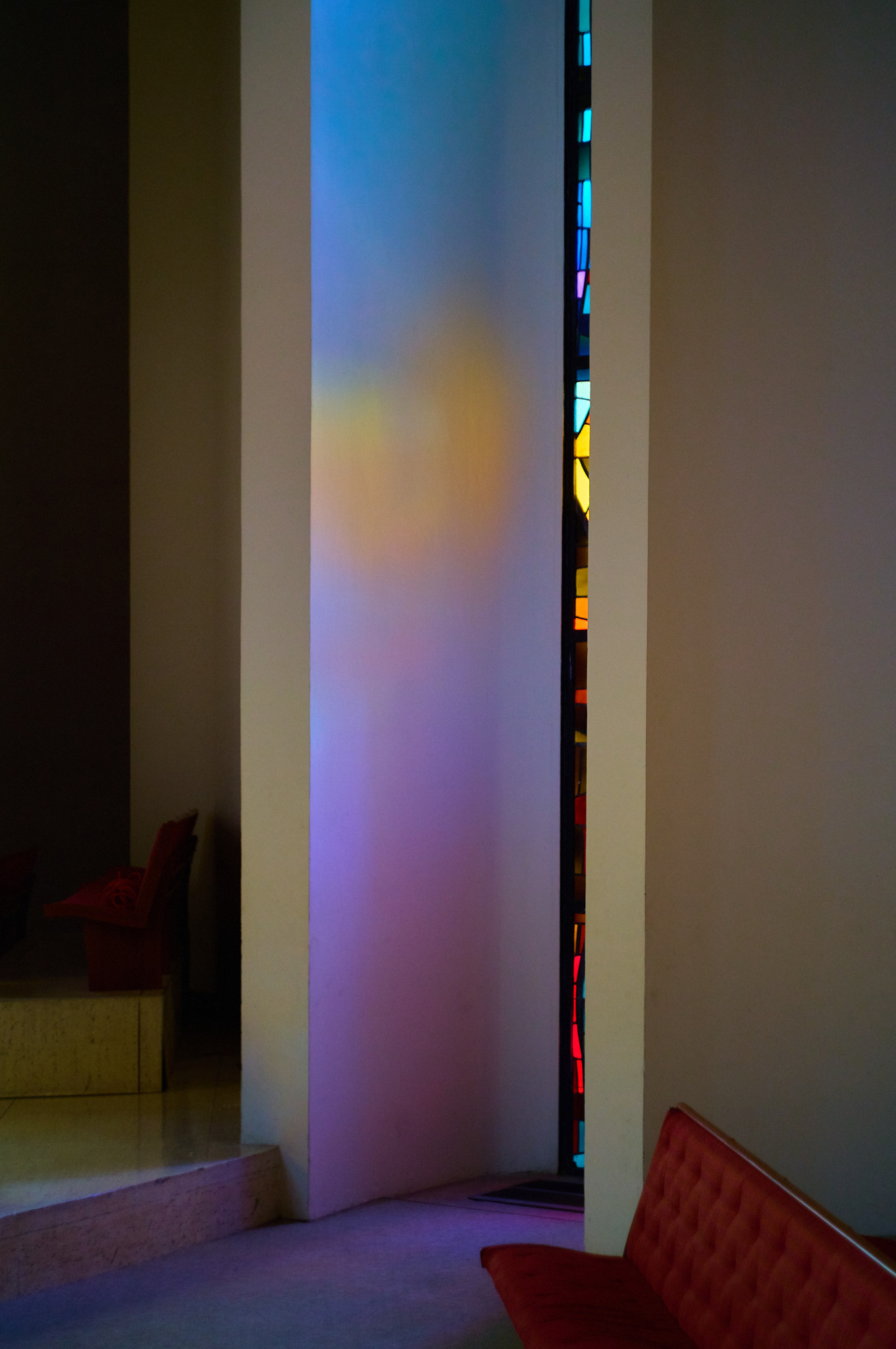
Last week was my first time inside. And I was alone. Not a sound in the chapel, and barely any light. Quite nice, though. Reverential. I’ve never really been a fan of stained glass, though I’ve come to understand it was quite popular in modernist churches here in Southern California. And while I didn’t love looking at the stained glass itself here, the colors they cast on the smooth interior walls were something to behold.
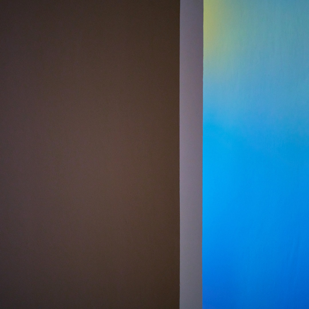
I’ll admit I boosted the saturation a little in post, but the effect was quite real in person.
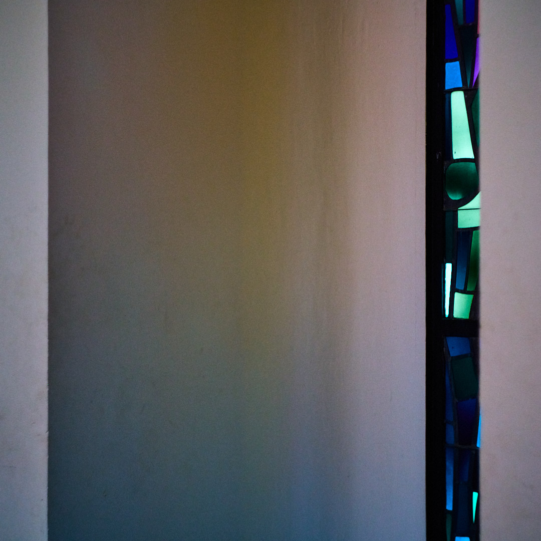
Not much else to say here; it’s a nice little building, if a little impersonal.